

HalalGo
HalalGo is a concept mobile app designed to improve ordering from halal food carts for both customers and vendors, reducing friction around payments, wait times, and order handoff through clear UX, friendly visuals, and purposeful motion.
Role
Designer
Responsibilities
Product design, animation, illustration
3 months
Duration
Role
Designer
Responsibilities
Product design, animation, illustration
3 months
Duration
01
Why I started this
While living in NYC, I often ordered from halal food carts and noticed consistent friction in the experience: cash-only payments, long in-person lines, and navigating inconsistent pricing in tourist-heavy areas. The process felt inefficient for customers and operationally heavy for vendors.
I started HalalGo as a product design exploration to see how thoughtful UX, UI, motion, and system design could simplify ordering, improve trust, and support both sides of the marketplace. The goal was to design a more transparent, efficient ordering system that benefits customers while giving vendors clear, streamlined tools to manage menus, pricing, and pickups with confidence.
02
Users & assumptions
HalalGo serves two primary user groups: vendors and customers. To better understand their needs and pain points, I conducted the following research:
-
Participants & context:
20 halal food customers and 10 halal cart vendors in NYC (Manhattan). Conversations focused on ordering, payment, and pickup process.
Key findings:
80% of customers avoid carts if they don’t have cash.
Vendors reported losing sales when customers ask “Do you take card?” and walk away.
Customers noticed that they are often charged higher prices in touristy areas.
Customers sometimes avoid ordering from halal carts when it’s very cold outside/snowing because they don’t want to wait in line.
Design implications:
Support cashless ordering and payment.
Transparent pricing in the app.
Design vendor tools that reduce order and payment friction.
Communicate realistic pickup readiness times to customers.
-
Participants & context:
Observed ordering behavior at 10 halal carts during lunch or dinner hours in winter. Watched queues, payment moments, vendor and customer interactions, and pickup flow.
Key findings:
Customers often wait just to ask about price, ingredients, or availability, causing longer lines and crowding.
Pickup gets congested when multiple orders are called verbally.
Vendors frequently need to reconfirm orders aloud (e.g., “chicken over rice, right?”) because ordering is verbal-only, creating confusion about ownership and accuracy of any food customizations.
Design implications:
Enable pre-ordering to reduce physical queues.
Show menu details before arrival.
Create a clear order status and pickup confirmation flow.
Provide a structured order customization feature so selections are captured digitally and clearly communicated to vendors.
Tie each order to a customer identity at pickup to reduce handoff confusion.
-
Participants & context:
Short online survey shared with halal food consumers (15 respondents). Focused on halal cart discovery and order customization.
Key findings:
Most respondents check Google/Maps but still walk to carts that are closed.
Participants often walk to their favorite carts only to discover they’re not operating that day, due to a lack of real-time availability signals.
Many don’t know allergen details until they ask in person.
Most respondents regularly customize their orders based on preferences or spice tolerance.
Design implications:
Add location-based cart discovery with real-time open/close status.
Require structured allergen and ingredient fields per item.
Provide a field/option to customize each food order.
-
Participants & context:
Competitive analysis of food ordering apps and existing vendor tools (e.g., Uber Eats, DoorDash, Square).
Key findings:
Most existing tools are designed for fixed-location restaurants, overlooking the needs of mobile food carts.
Vendor onboarding flows are lengthy and not optimized for the constraints of mobile operations.
Many platforms prioritize delivery features that are unnecessary for halal cart vendors and add avoidable complexity.
Design implications:
Reduce setup friction by tailoring onboarding to the realities of mobile halal cart operations.
Design easy-to-use, halal cart–specific management tools for fast menu setup, pricing, and order handling.
Remove unnecessary delivery complexity in favor of pickup-first vendor experiences.
Vendors (halal cart operators) — Core needs
-

Order visibility
Vendors need a clear overview of incoming, in-progress, and completed orders to manage pickup flow and track performance over time.
-

Cashless selling
Vendors need a way to accept digital payments so they don’t lose sales when customers don’t carry cash.
-

Menu clarity & trust
Vendors need to list ingredients and allergens upfront to reduce disputes, answer questions faster, and build customer trust.
-

Customer discoverability
Vendors need to be easily findable by nearby customers to increase foot traffic and repeat business.
-

Customer loyalty
Vendors benefit from staying connected with repeat customers instead of relying solely on random walk-ups.
Customers — Core needs
-

Cash-free ordering
Customers want to order and pay digitally without needing to carry cash.
-

Line avoidance
Customers want to place orders without standing in long lines, especially in cold or crowded NYC conditions.
-

Transparent pricing
Customers want consistent, visible pricing so they aren’t charged more based on appearance or tourist status.
-

Location discovery
Customers need a reliable way to find nearby halal carts, since many aren’t listed on traditional maps.
-

Open/closed visibility
Customers want to know whether a cart is operating before walking to it.
-

Allergen confidence
Customers want clearly listed ingredients and allergens to order safely and quickly.
Product hypotheses (assumptions)
If vendors have a simple digital order dashboard…
1
they can fulfill pickups faster and reduce customer confusion during peak hours.
If customers can pay digitally…
2
vendors will capture more sales that are currently lost due to cash-only limitations.
If pricing is visible and standardized in-app…
3
customers will feel safer ordering and vendors will build long-term trust.
If customers can see nearby carts and operating status…
4
they will be more likely to walk to a vendor and place an order.
If customers can order ahead…
5
perceived wait time will drop and satisfaction will increase.
If vendors can publish ingredients and allergens…
6
order disputes and on-the-spot questioning will decrease.
If vendors are easy to find and re-order from…
7
repeat usage and loyalty will increase.
03
Design goals
These goals guided the product, UX, and motion design decisions for HalalGo:
Reduce vendor onboarding friction
Enable fast, cashless ordering
Improve order clarity and fulfillment
Make halal carts easy to discover
Increase trust through transparent pricing and allergens
Reduce perceived wait time
Support repeat engagement and loyalty
Use motion to communicate state, not decoration
04
Vendor experience
Rather than documenting every individual feature, I selected the two vendor journeys because they represent the most crucial moments in the vendor experience: getting set up to sell and fulfilling orders accurately and efficiently.
Vendor Journey:
Onboarding → Menu Creation
-
![]()
Empty State Dashboard
During onboarding, vendor lands on an empty menu screen with an empty-state illustration and CTA.
Design rationale: Frames menu creation as the primary action required to start selling, while using an empty state to guide first-time vendors without overwhelming them with many instructions. -
![]()
Create First Menu Category
Clear CTA: “Add your first menu category (e.g. Platters, Wraps).”
Design rationale: Explicit language makes it clear that categories have to be added first since items are later added to each category. -
![]()
Add Items to Menu
Vendor adds items with name, price, illustration, and allergens.
Design rationale: Structured inputs ensure consistency in pricing and allergen disclosure, preventing disputes and improving customer trust. -
![]()
Save & Continue Later
Vendor can pause onboarding and return later.
Design rationale: It is realistic to allow setup to happen in increments and prevents overwhelming the vendor, instead of forcing completion in one session under time pressure. -
![]()
Menu Overview
Vendor sees published categories and items.
Design rationale: Provides immediate feedback on setup progress and signals that the vendor is ready to accept digital orders.





Vendor Journey:
Order Management → PIN Verification
-
![]()
Incoming Orders Dashboard
Vendor sees active orders with clear status labels (e.g., “In progress,” “Ready for pickup”) and incoming orders that require confirmation. Each order includes a timestamp.
Design rationale: Clear status states and timestamps reduce cognitive load during peak hours and help vendors prioritize orders based on customer order time. -
![]()
Prepare Order
Vendor confirms an incoming order and reviews any written customizations.
Design rationale: Written confirmations eliminate verbal miscommunication. Confirming an order lets customers know that their order is actively being prepared. -
![]()
Mark Ready for Pickup
Vendor updates the order status, triggering a notification to the customer.
Design rationale: Status-based notifications replace shouted names in crowded environments and let customers know exactly when to head to the cart. -
![]()
Verify PIN at Pickup
Customer provides PIN; vendor verifies in-app.
Design rationale: PIN verification ensures the correct order is handed to the correct customer, reducing errors and building trust during busy pickup moments. -
![]()
Completion Feedback
Vendor sees a confirmation screen with a subtle checkmark indicating the order is complete.
Design rationale: Clear completion feedback provides operational closure and confirms successful payout in the transaction process.
Clear completion animations, contextual tooltips, and simple toggles reduce onboarding friction, while flexible menu setup and a neutral empty-state animation guide vendors without overwhelming them or creating false expectations.
A. Onboarding & Empty States
A. Onboarding & Empty States
Clear completion animations, contextual tooltips, and simple toggles reduce onboarding friction, while flexible menu setup and a neutral empty-state animation guide vendors without overwhelming them or creating false expectations.
-
![]()
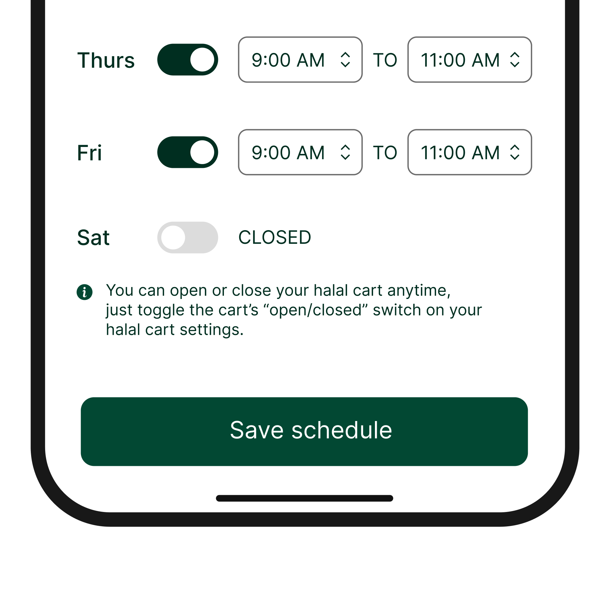
Contextual tooltips
These offer guidance since onboarding can feel overwhelming or confusing.
-
![]()
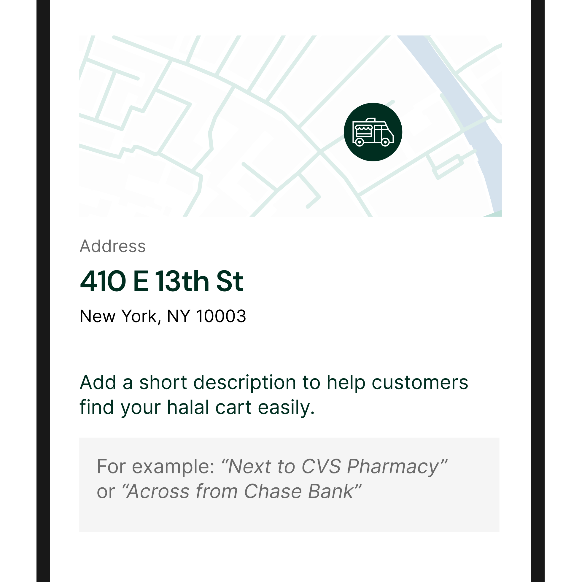
Location guidance field
Short descriptions during location setup helps customers easily find carts in busy street environments.
-
![]()
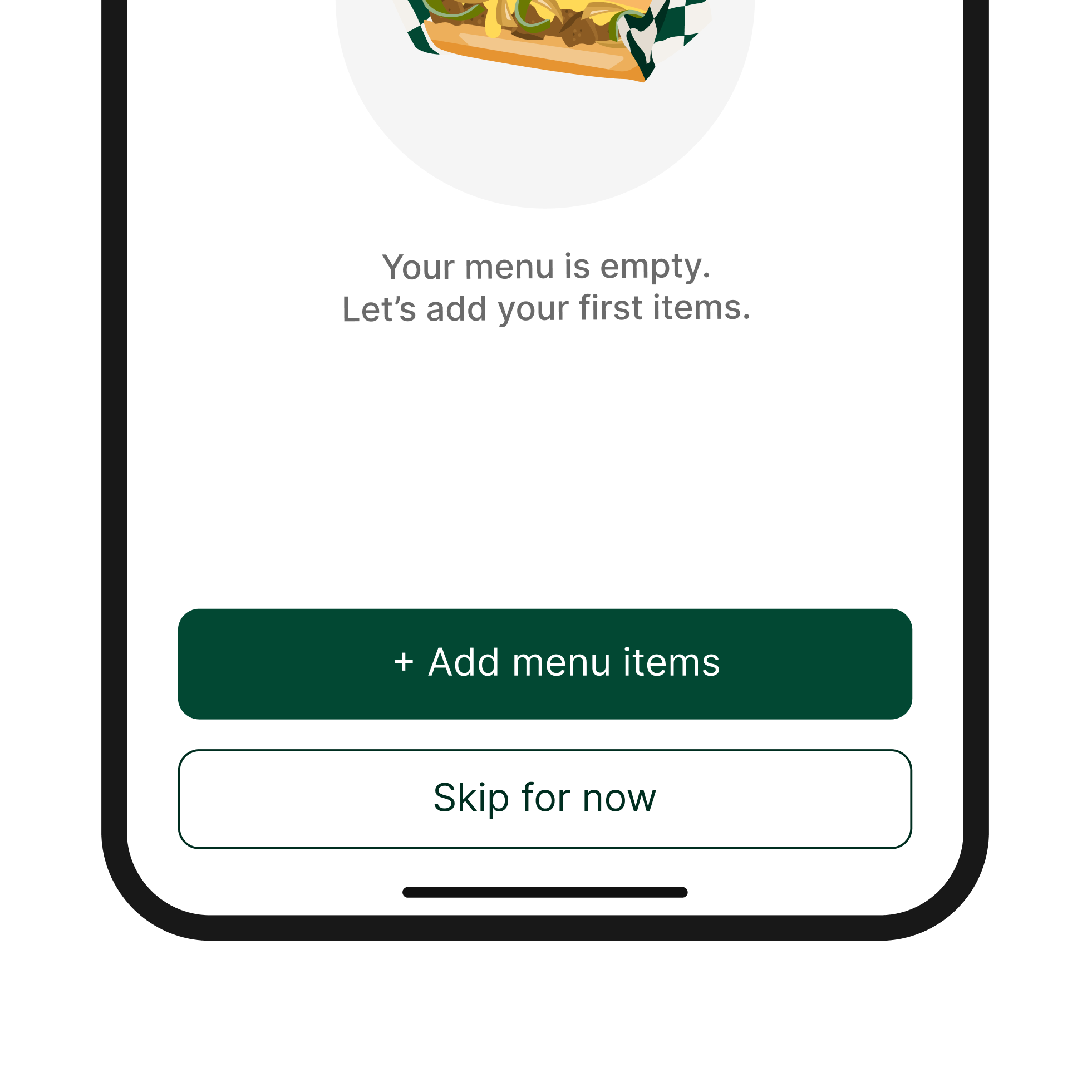
Skip for now option
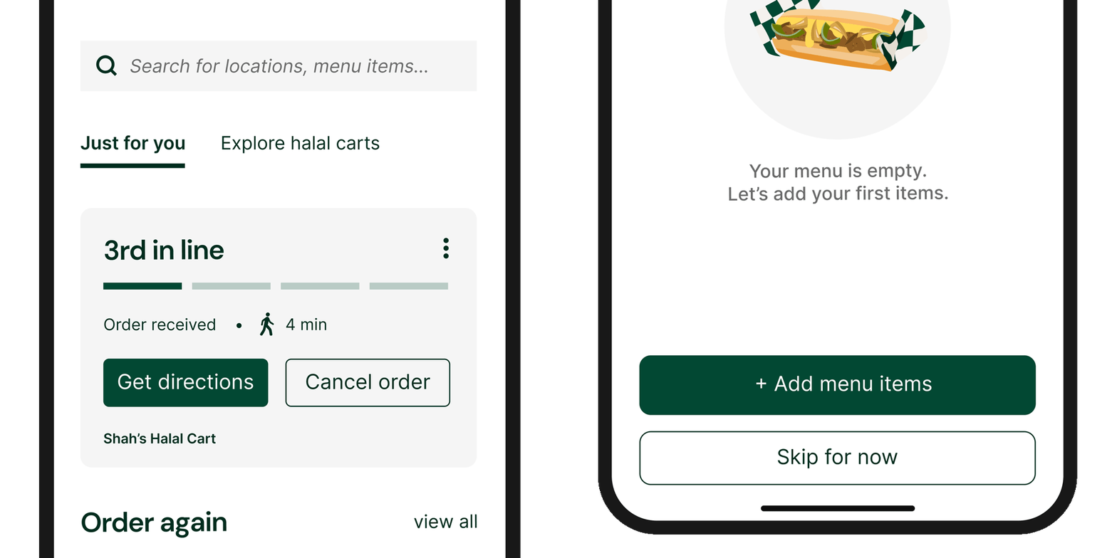
Menu setup can be time-intensive, especially when verifying allergen information. Allowing vendors to skip this step for now supports flexible, real-world workflows without blocking onboarding completion.
-
![]()
Empty menu animation
Neutral food illustrations without item labels communicate an empty state while encouraging action, without implying that any menu items already exist. Muted gray text reinforces that the menu has not yet been built.
The menu builder was designed to minimize manual input by providing pre-built items, visuals, and allergen selections, allowing vendors to publish accurate menus quickly and consistently.
B. Menu Creation System
B. Menu Creation System
The menu builder was designed to minimize manual input by providing pre-built items, visuals, and allergen selections, allowing vendors to publish accurate menus quickly and consistently.
-
![]()
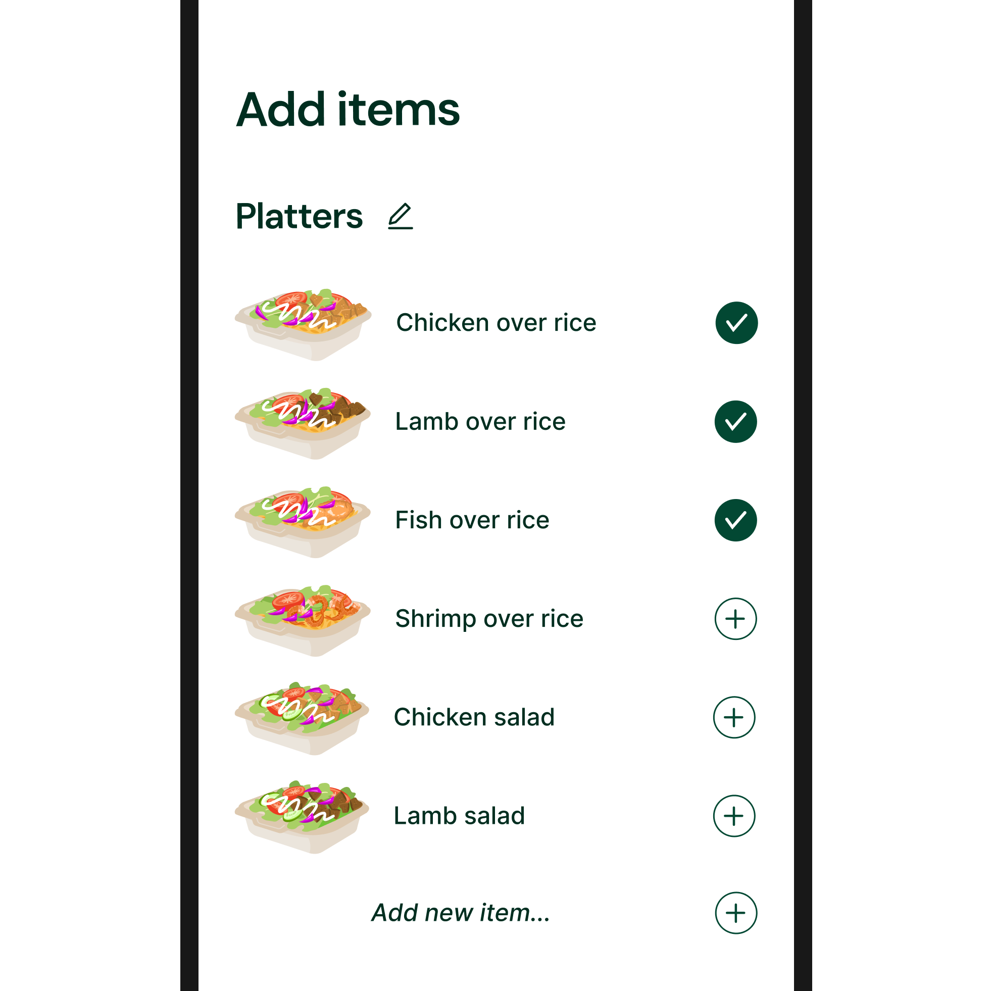
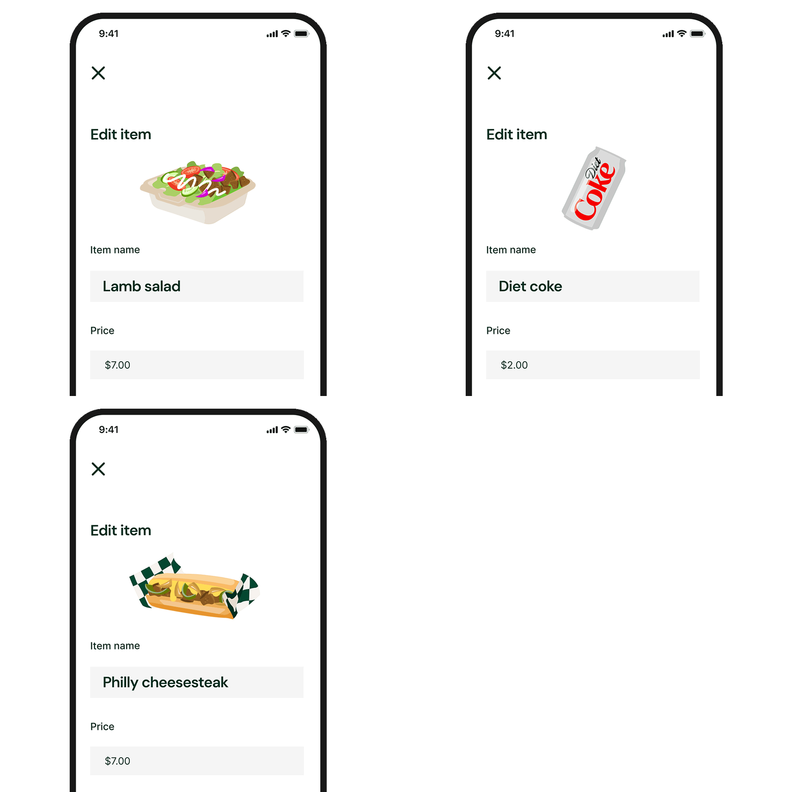
Pre-built menu items
Common halal cart items are pre-filled within each category, allowing vendors to add items with a single tap instead of creating everything from scratch.
-
![]()
Pre-made illustrations
Each item includes a default illustration, so vendors only need to adjust pricing and allergens without sourcing their own photos. This maintains brand cohesion and prevents low-quality images from impacting the customer experience.
-
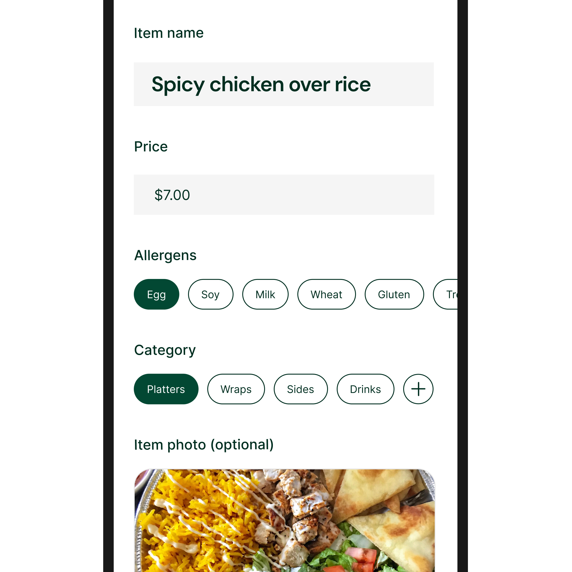
![]()
“Add a new item” option
For unique menu items, vendors can upload their own photo and create custom item names, keeping the system flexible without sacrificing structure.
-
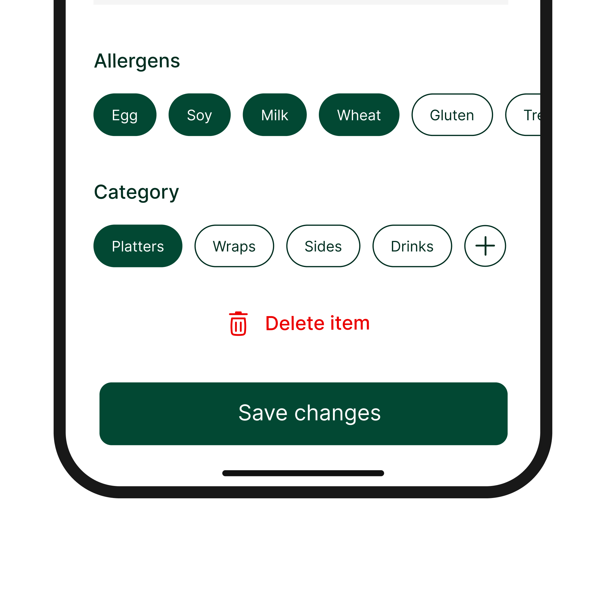
![]()
One-tap allergen selection
Common food allergens are selectable with a single tap, reducing manual entry.
-
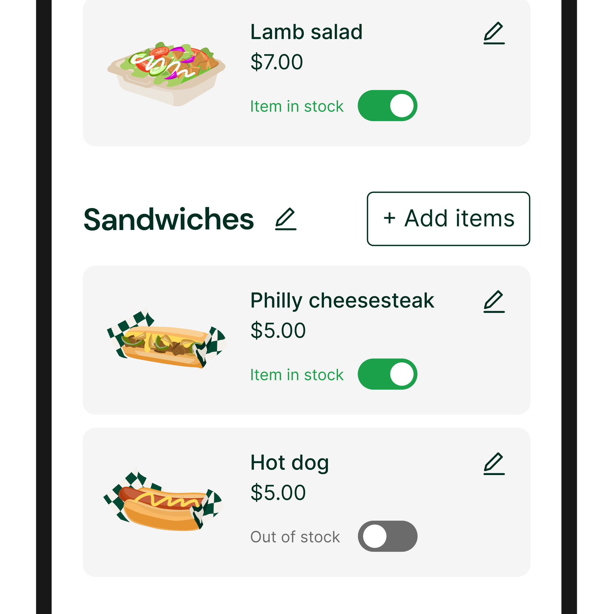
![]()
Out-of-stock toggle
A simple toggle lets vendors mark items as unavailable, keeping menus up to date without deleting or rebuilding listings.
The dashboard was designed to mirror how kitchen staff naturally prioritize and prepare orders, using visual hierarchy, color, and formatting to support fast scanning and real-time decision-making.
C. Order Management Dashboard
C. Order Management Dashboard
The dashboard was designed to mirror how kitchen staff naturally prioritize and prepare orders, using visual hierarchy, color, and formatting to support fast scanning and real-time decision-making.
-
![]()
Pre-built menu items
Common halal cart items are pre-filled within each category, allowing vendors to add items with a single tap instead of creating everything from scratch.
-
![]()
Pre-made illustrations
Each item includes a default illustration, so vendors only need to adjust pricing and allergens without sourcing their own photos. This maintains brand cohesion and prevents low-quality images from impacting the customer experience.
-
![]()
“Add a new item” option
For unique menu items, vendors can upload their own photo and create custom item names, keeping the system flexible without sacrificing structure.
-
![]()
One-tap allergen selection
Common food allergens are selectable with a single tap, reducing manual entry.
-
![]()
Out-of-stock toggle
A simple toggle lets vendors mark items as unavailable, keeping menus up to date without deleting or rebuilding listings.
The pickup flow was designed to replace verbal coordination with a simple, secure confirmation step that ensures accurate handoffs and clear order completion.
D. Pickup & PIN Verification
D. Pickup & PIN Verification
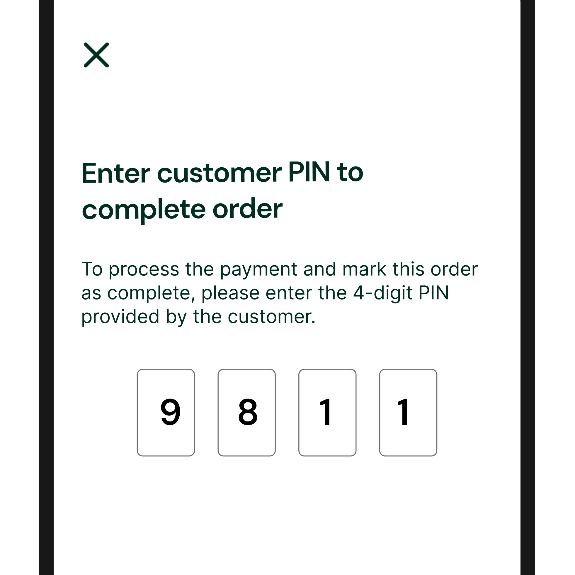
The pickup flow was designed to replace verbal coordination with a simple, secure confirmation step that ensures accurate handoffs and clear order completion.
-
![]()
PIN-based pickup confirmation
Vendors verify the customer’s PIN before handing off the order, ensuring the correct order goes to the correct person during busy pickup periods.
-
![]()
Completion feedback
A subtle green checkmark animation confirms successful pickup and signals that payment is processing, providing clear operational closure without disrupting the workflow.
05
Customer experience
Rather than documenting every individual feature, I focused on the two customer journeys that best represent HalalGo’s core value: first-time ordering and repeat engagement, while smaller interactions such as viewing hours or searching via item are embedded within them.
Customer Journey:
Discover → Order → Pickup
-
![]()
Nearby Discovery
Customer lands on the home screen showing nearby halal carts with open/closed state or operating hours.
Design rationale: Displaying real-time availability helps customers avoid walking to closed halal carts. -
![]()
Menu Exploration
Tapping a cart opens a menu with illustrations, prices, and allergens.
Design rationale: A rich menu view with visuals and allergen disclosure minimizes line congestion and supports faster, safer ordering for both customers and vendors. -
![]()
Item Customization
Customer gets the option to customize items (e.g. no hot sauce, etc) in a text field.
Design rationale: Written modifications prevents miscommunication and ensures orders match customer expectations. -
![]()
Checkout & Payment
Customer reviews their order and pays digitally.
Design rationale: Enabling cashless checkout solves the cash-only friction and avoids missed sales for vendors. -
![]()
Order Tracking
Customer sees prep status and estimated pickup time.
Design rationale: Showing live status and timing reduces wait-time anxiety and lets customers plan when to start heading to the halal cart. -
![]()
Pickup Confirmation
Customer arrives at halal cart and shows a PIN for verification.
Design rationale: PIN verification ensures the right order reaches the right customer and prevents handoff confusion during busy periods.


Customer Journey:
Favorite → Reorder
-
![]()
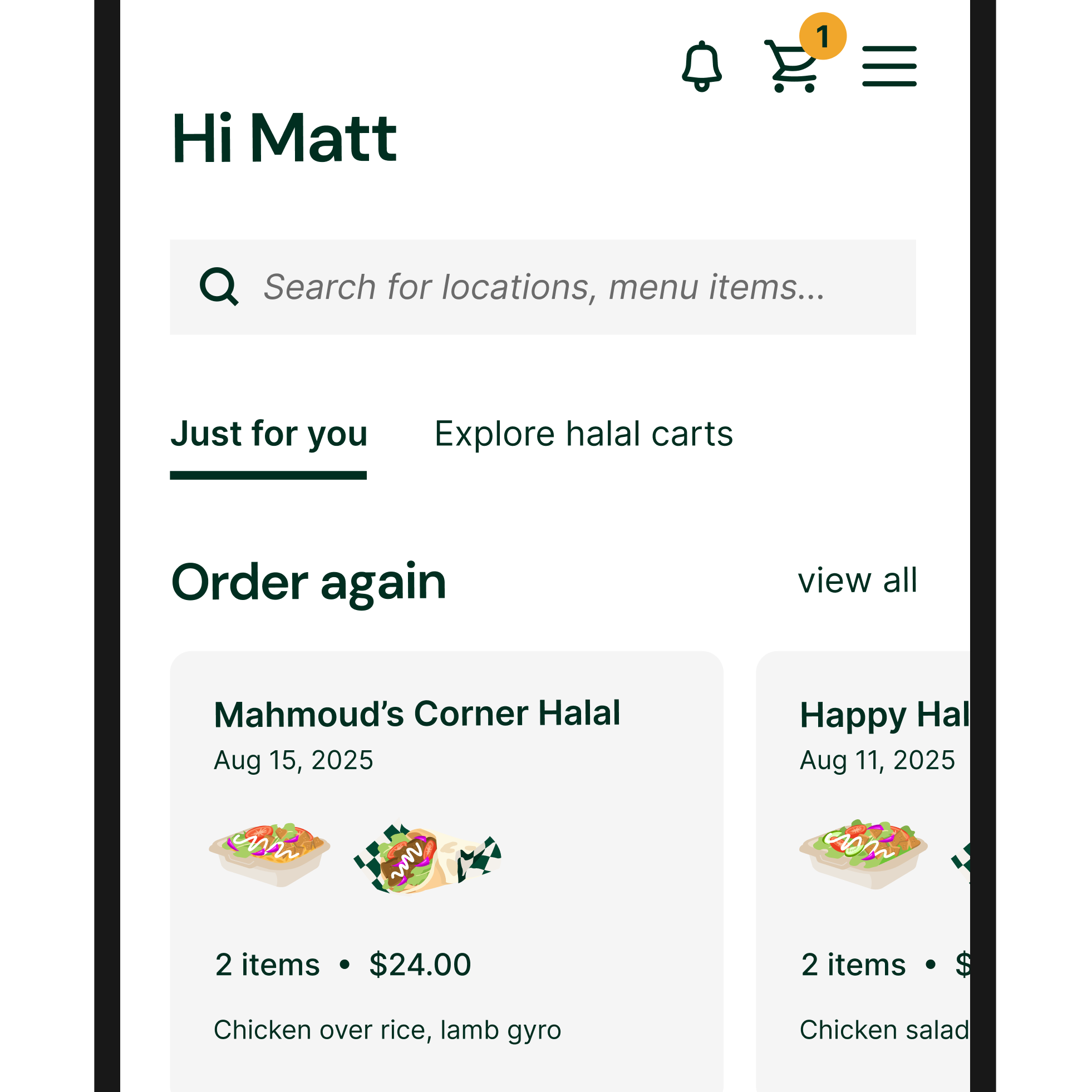
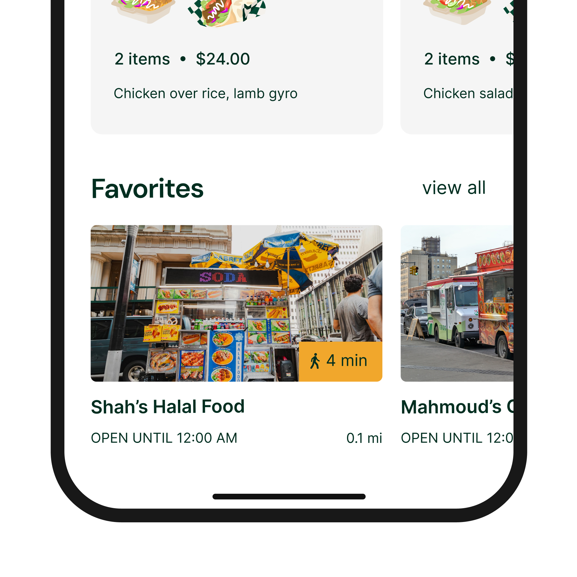
Favorites Access
Customer sees their favorited halal carts directly on the home screen.
Design rationale: Supports customer loyalty by giving instant access to favorite vendors without extra steps. -
![]()
Quick Menu Access
Customer opens a favorite cart and sees previously ordered items.
Design rationale: Surfacing familiar items shortens decision time and supports fast, habitual ordering. -
![]()
Modify & Reorder
Customer modifies their order (e.g. extra white sauce) and checks out.
Design rationale: Allowing edits on past orders preserves flexibility while keeping reordering fast and low-effort. -
![]()
Status & Pickup
Order status and pickup timing are shown immediately.
Design rationale: Consistent feedback on timing reinforces trust and reliability for returning customers.

The home experience was designed to help customers quickly find nearby halal carts, confirm they’re open, and feel confident about pricing before they walk over.
A. Discover & Trust
A. Discover & Trust
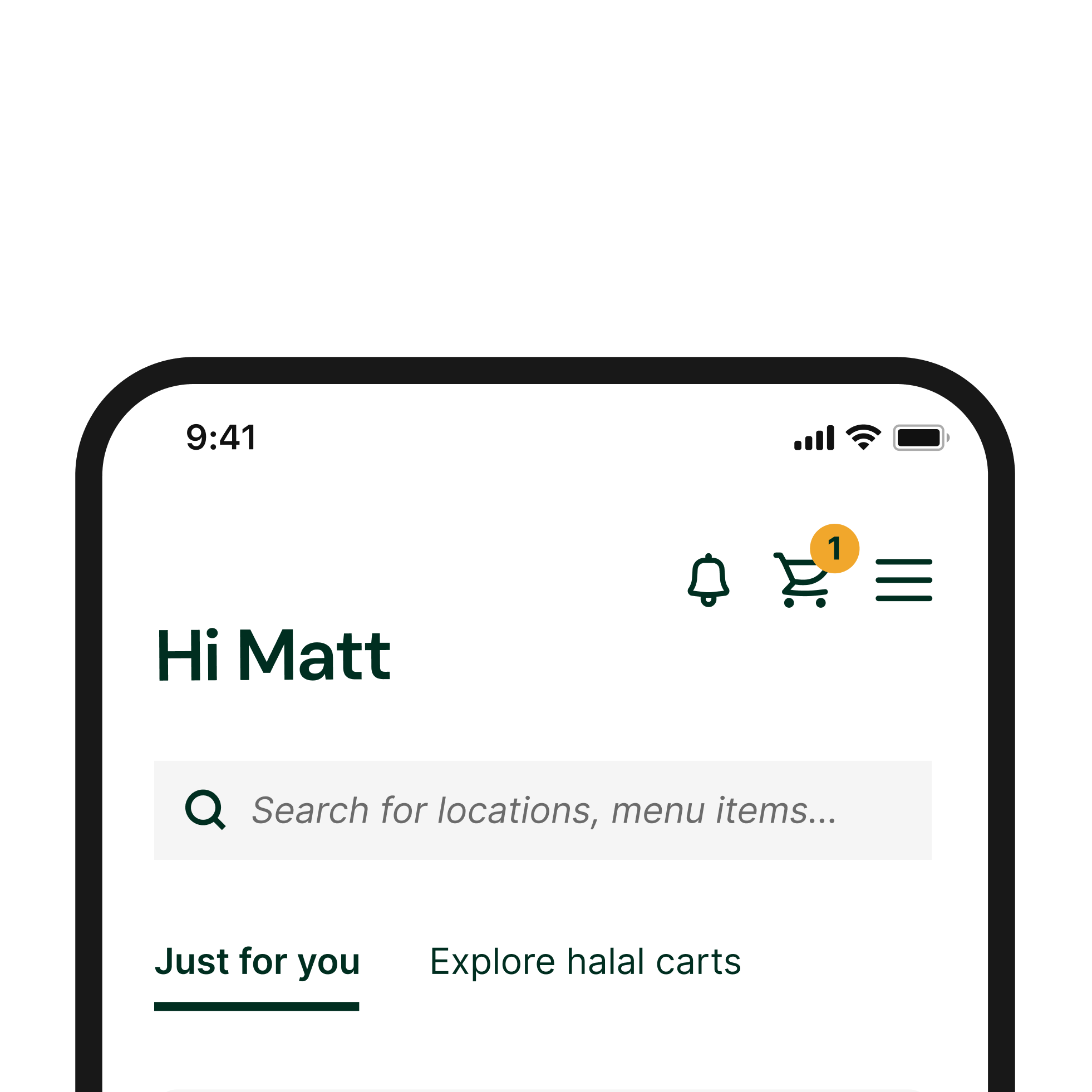
The home experience was designed to help customers quickly find nearby halal carts, confirm they’re open, and feel confident about pricing before they walk over.
-
![]()
Multiple discovery paths
Customers can explore halal carts through nearby lists, a map view, or search—supporting both casual browsing and goal-driven searches.
-
![]()
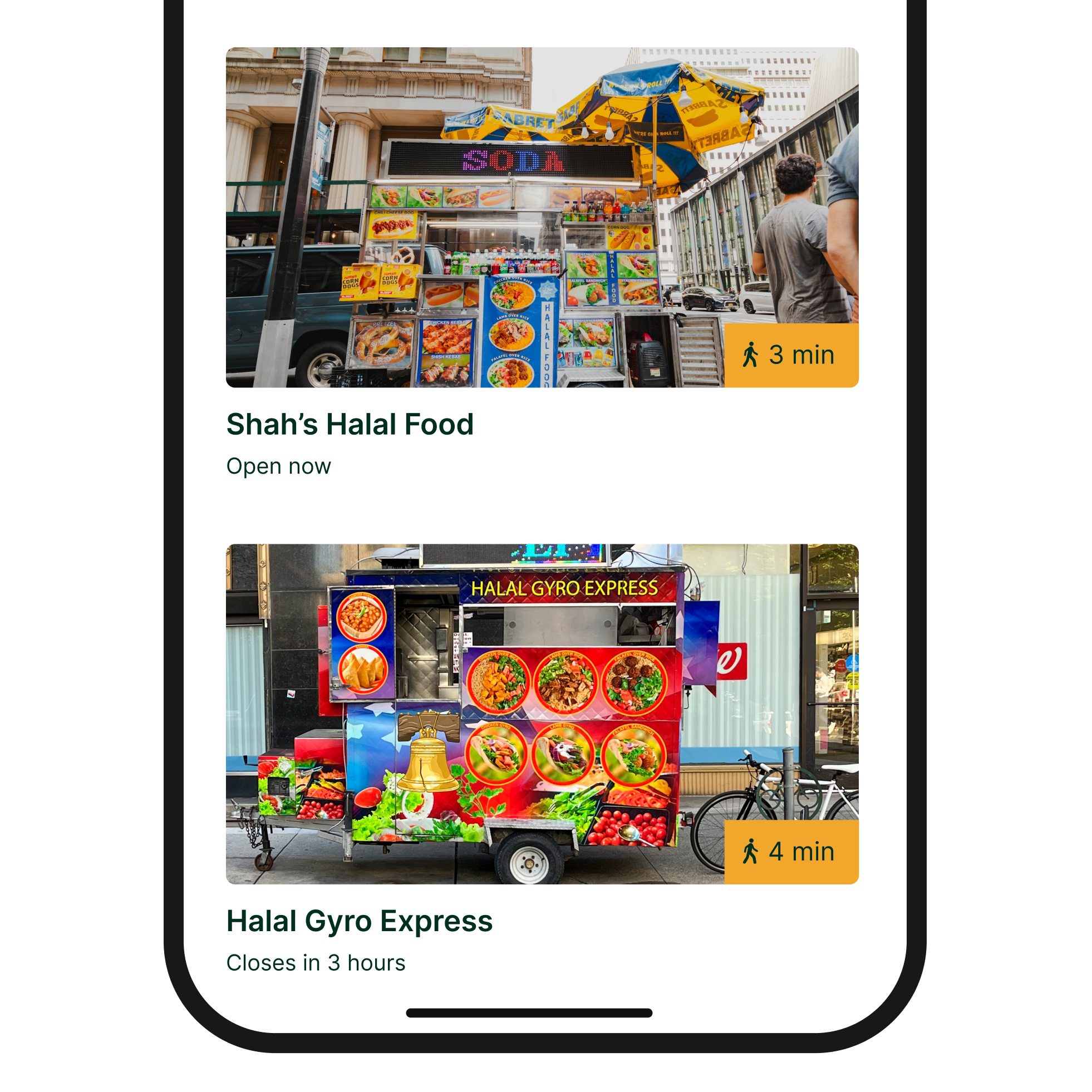
Open/closed visibility
Each cart card shows real-time operating status or hours, helping customers avoid walking to closed vendors.
-
![]()
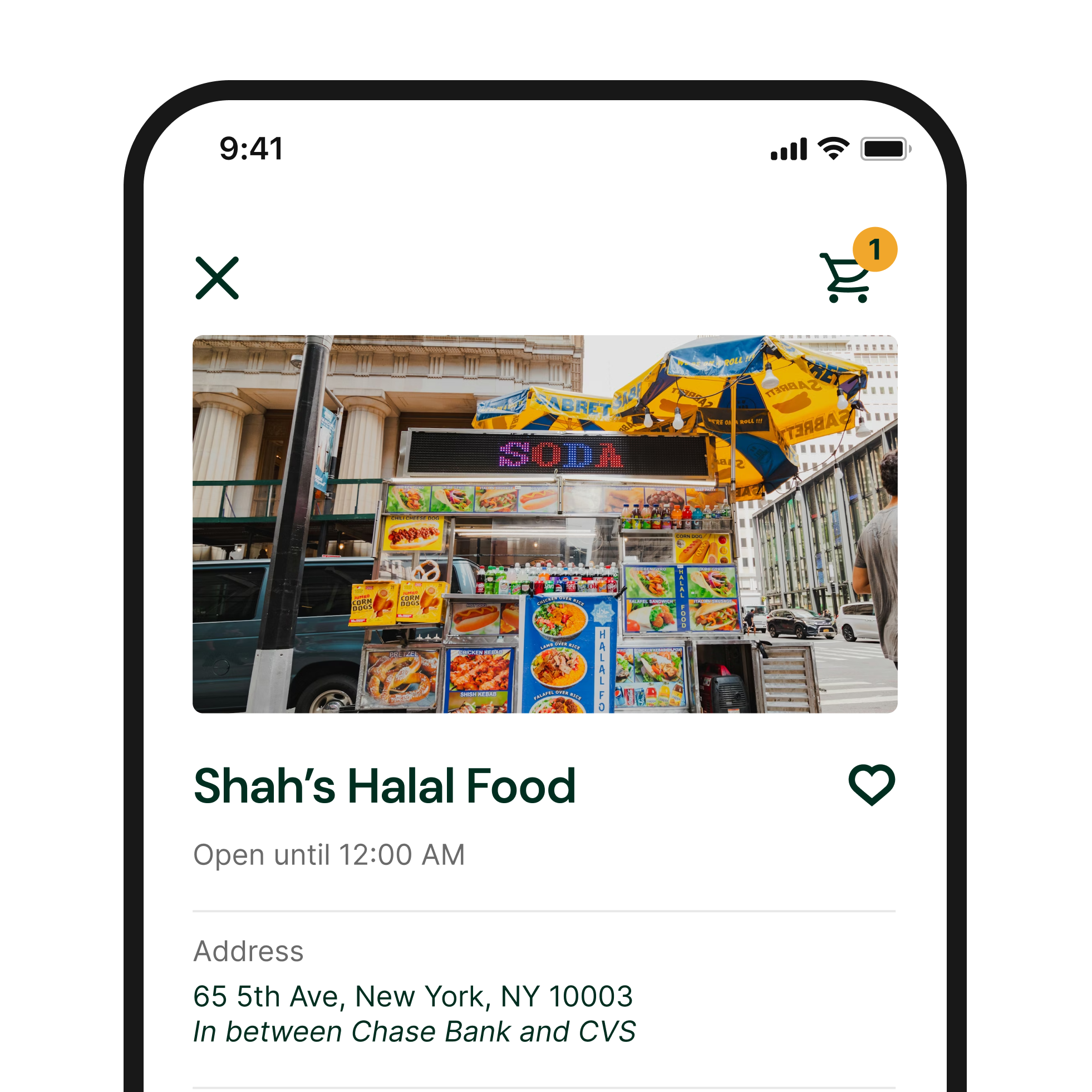
Real-world location guidance
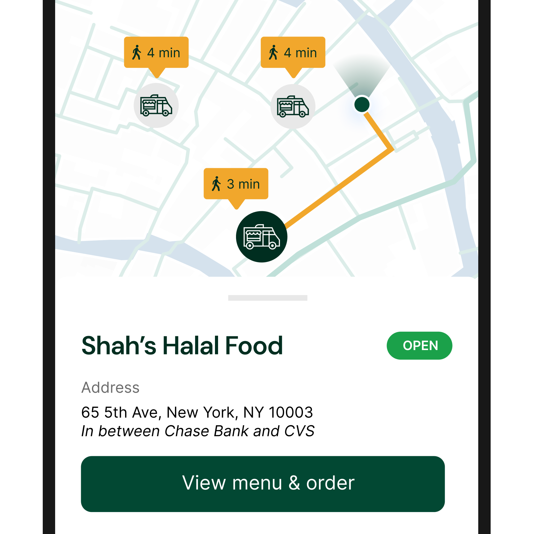
Expanded cart details include address, walking time, and short wayfinding descriptions (e.g., “between Chase and CVS”), improving street-level navigation beyond a map pin.
-
![]()
Transparent pricing
Menu pricing is visible before ordering, giving customers confidence that prices are consistent and not adjusted based on appearance or tourist status.
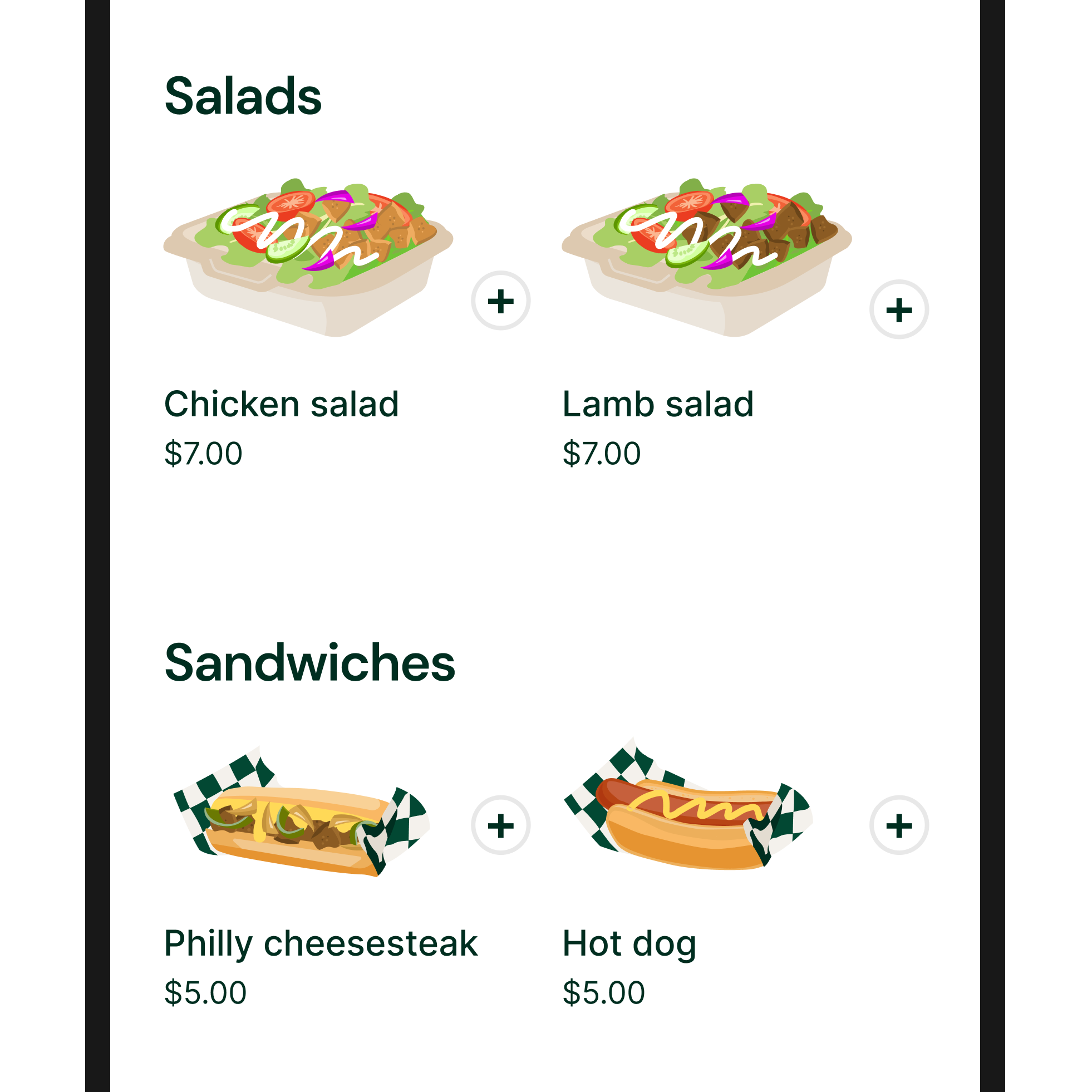
The menu experience was designed to help customers quickly understand what they’re ordering, customize with confidence, and make informed choices without needing in-person clarification.
B. Menu Browsing & Customization
B. Menu Browsing & Customization
The menu experience was designed to help customers quickly understand what they’re ordering, customize with confidence, and make informed choices without needing in-person clarification.
-
![]()
Pre-made food illustrations
Standardized illustrations make menu items visually appealing while maintaining brand consistency and preventing low-quality vendor-uploaded photos from impacting the customer experience.
-
![]()
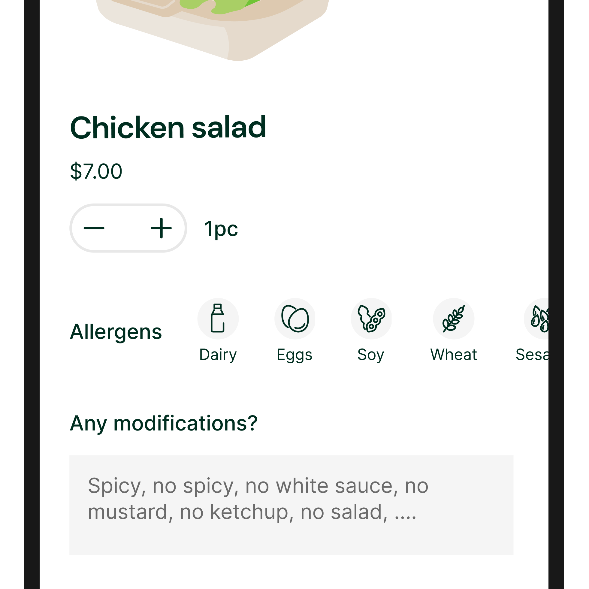
Allergen transparency
Each menu item includes a clear list of allergens, allowing customers to order safely and confidently without needing to ask in person.
-
![]()
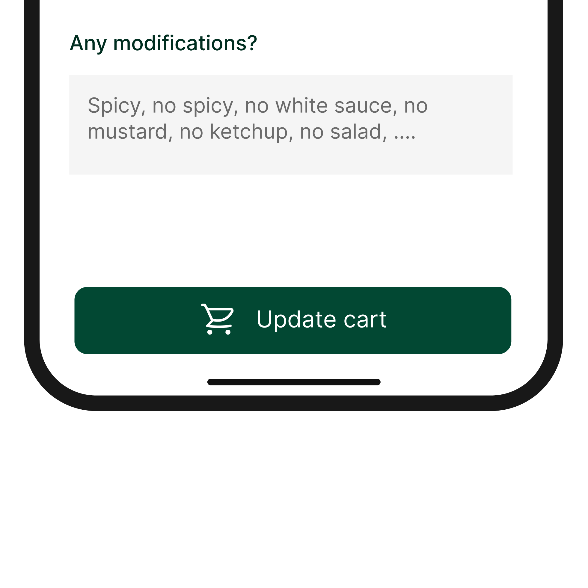
Guided customization
A tooltip within the customization field suggests common modifications (e.g., “no hot sauce,” “extra white sauce”), helping users understand how to tailor their order without uncertainty.
-
![]()
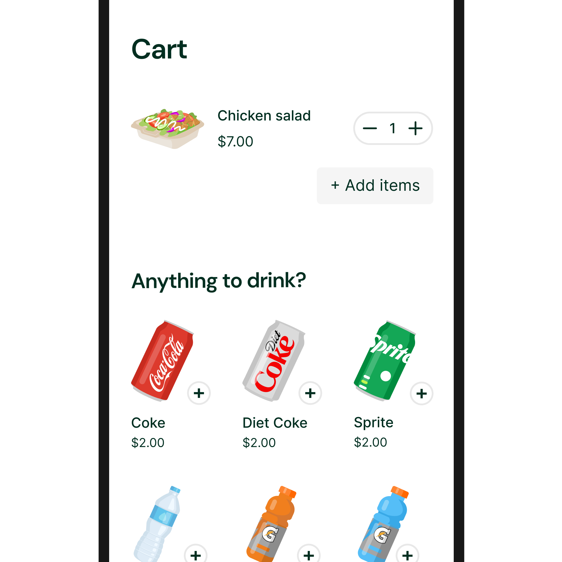
Smart add-on suggestions
Before checkout, customers see suggested add-ons like drinks, encouraging complete meals and supporting higher vendor sales.
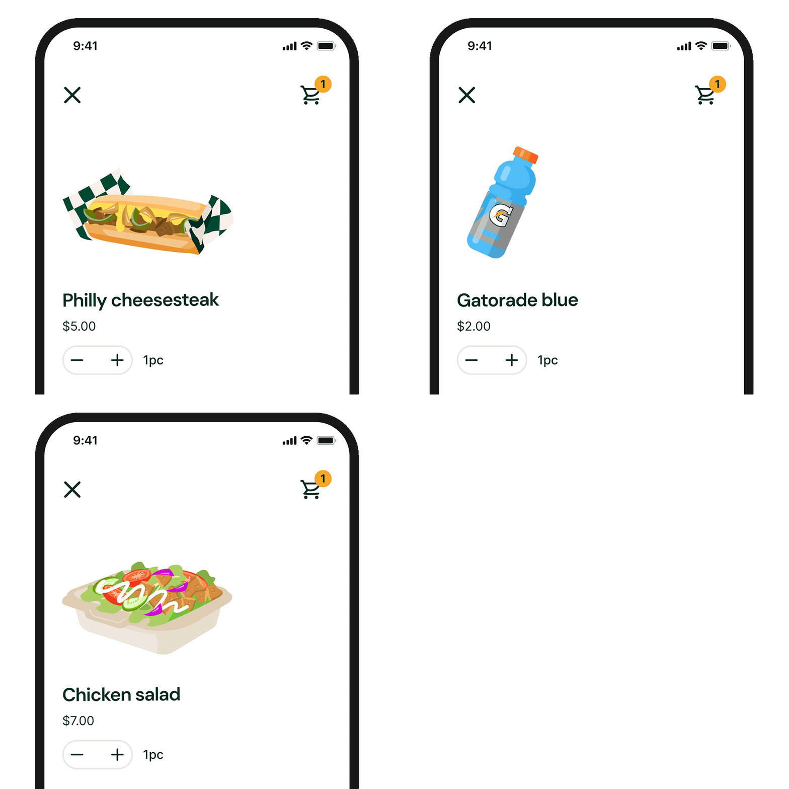
The post-checkout experience was designed to reassure customers, reduce uncertainty while waiting, and clearly communicate when their order is ready for pickup.
C. Checkout, tracking & pickup
C. Checkout, tracking & pickup
The post-checkout experience was designed to reassure customers, reduce uncertainty while waiting, and clearly communicate when their order is ready for pickup.
-
![]()
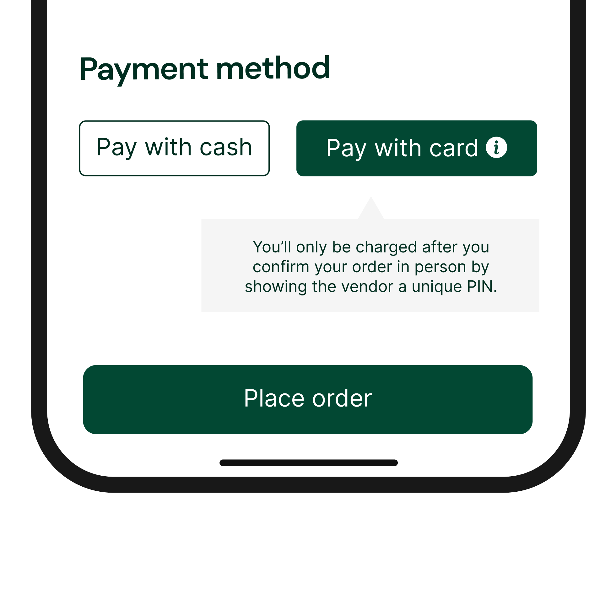
Flexible and reassuring payment options
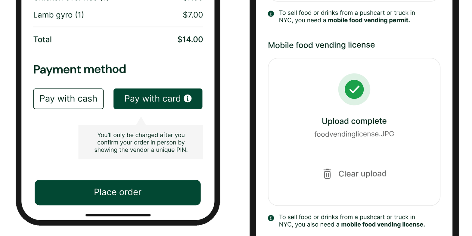
Customers can choose to pay with cash in person or by card, with clear reassurance that card charges only occur after successful PIN verification—reducing anxiety around digital payment.
-
![]()
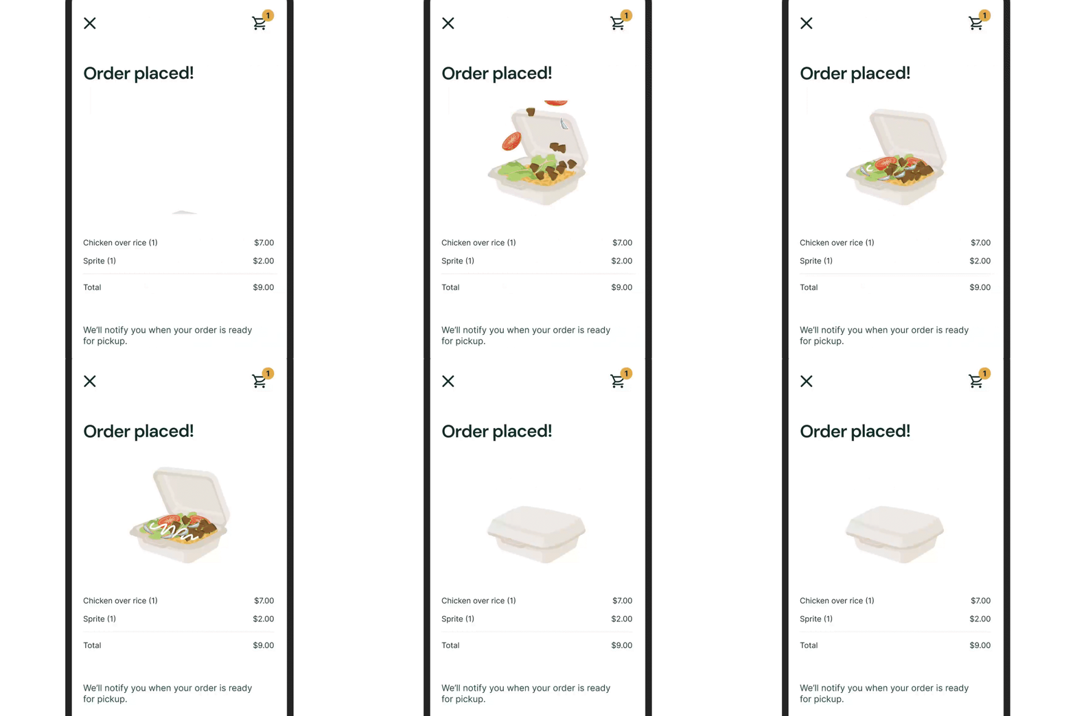
Order placed animation (plays once)
A celebratory animation shows a halal platter assembling itself to mark successful order placement. The animation plays once to clearly signal completion rather than an ongoing state.
-
![]()
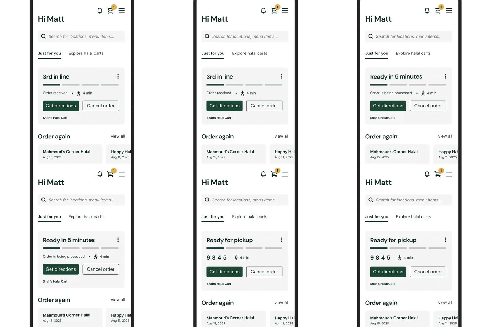
Real-time order status hierarchy
Place in line and estimated wait times are displayed as the most prominent elements on the home screen, reducing anxiety.
-
![]()
Ready-for-pickup animation (plays once)
When the order is ready, the platter transitions into a closed paper bag, signaling that the food is ready for handoff. Like the confirmation animation, it plays once to communicate a finished state.
The reordering experience was designed to help returning customers place repeat orders quickly while reinforcing loyalty to their favorite halal carts.
D. Favorites & reordering
D. Favorites & reordering
The reordering experience was designed to help returning customers place repeat orders quickly while reinforcing loyalty to their favorite halal carts.
-
![]()
One-tap reordering
Customers can reorder past meals directly from their home screen, reducing friction for repeat purchases.
-
![]()
Favorite carts
Customers can save their favorite halal carts for quick access via their homepage, keeping trusted vendors easy to return to.
06
UI system
Design Principles
Inspired by the street
1
Colors and visuals draw directly from the halal food experience: deep green symbolizes trust and halal identity, while warm yellow echoes the vibrant energy of classic halal rice.
Clear at a glance
2
High-contrast colors and clean layouts ensure information is easy to scan in fast-paced, outdoor environments.
Friendly and approachable
3
Vibrant illustrations and organic forms make the experience feel welcoming for both vendors and customers.
Purposeful motion
4
Animations are used to communicate state, not decorate.
Color System — Primary Brand Colors
-

Text Green
#002E20
Used for primary text throughout the app to ensure high contrast and readability.
-

Halal Green
#024833
A slightly lighter green inspired by traditional halal food iconography, reinforcing brand identity and cultural familiarity.
-

Basmati Rice Yellow
#F1A72C
A warm yellow inspired by halal rice dishes, used to highlight key information.
-

White Sauce
#FFFFFF
Used as the primary background color to allow content to stand out.
Color in context — Status & state colors
-
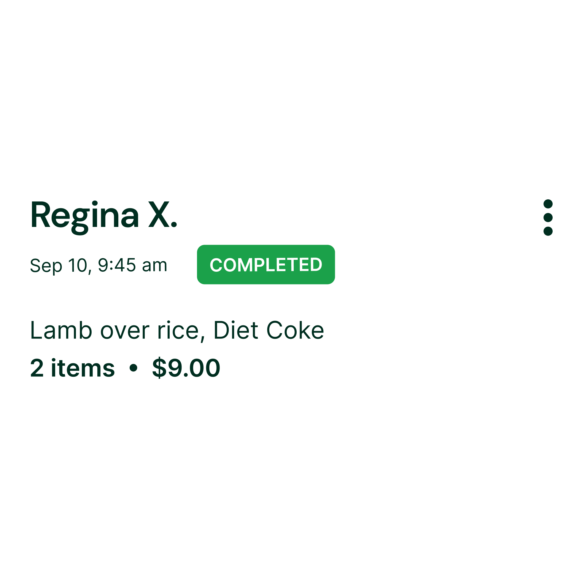
Correct State Green
(Success / Open / Complete)
Used to communicate completion and positive states, such as verified documents, completed orders, and open vendor status.
-
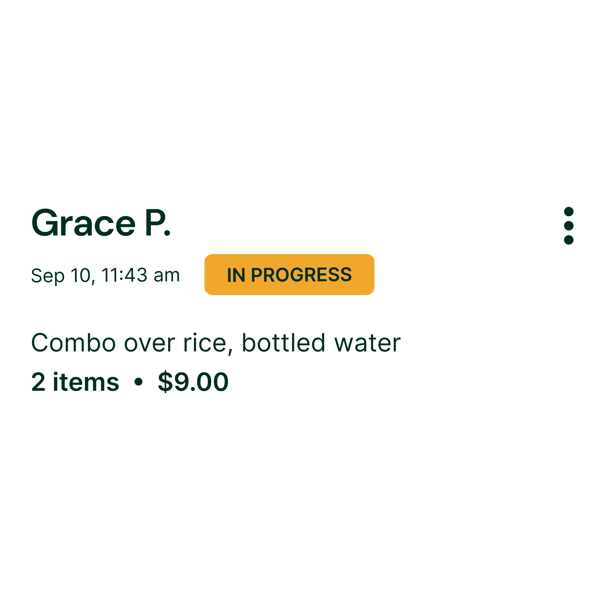
Basmati Rice Yellow
(In Progress)
Repurposed to indicate active, in-progress states, signaling that an action is underway.
-
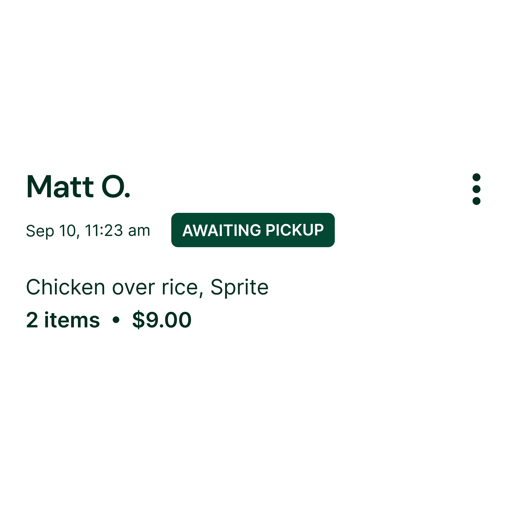
Halal Green
(Awaiting Pickup)
Used for orders that are ready but not yet completed, creating a clear visual distinction between preparation and fulfillment.
-
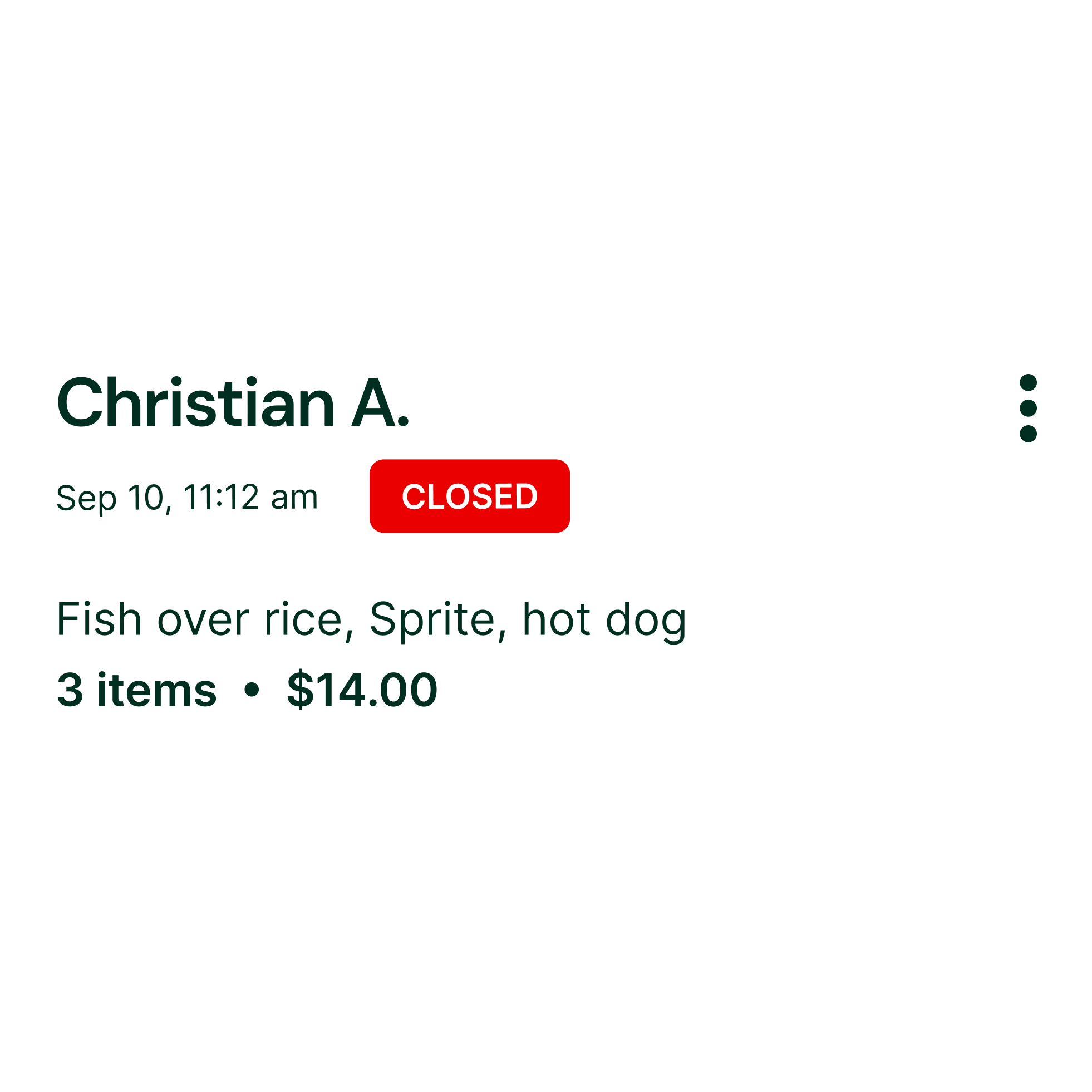
Hot Sauce Red
(Destructive / Closed)
Reserved for destructive actions like deleting items or indicating closed orders.
Color in context — Neutral & Supporting Colors
-
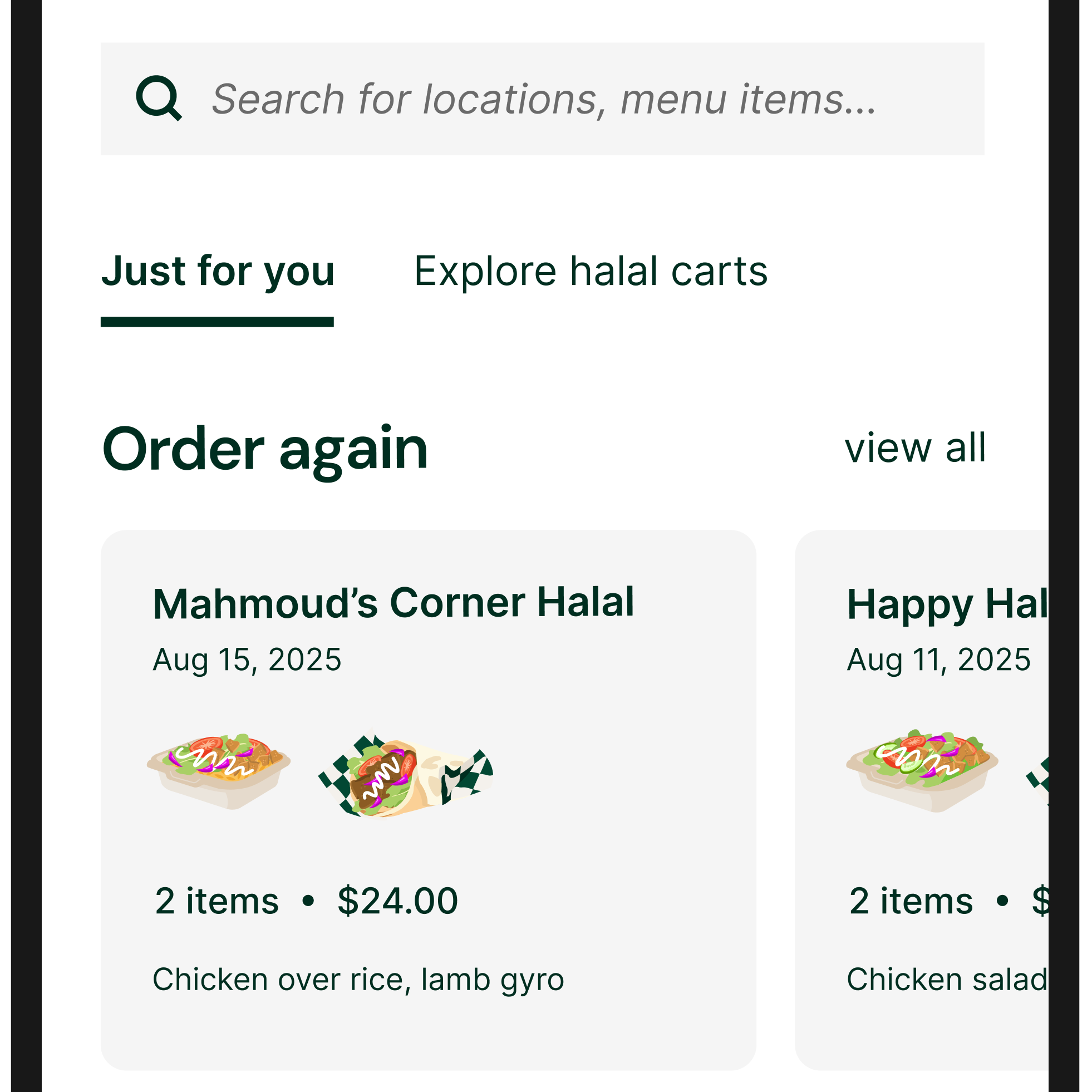
Light Gray
(Containers & Inputs)
Used for order cards and text fields to create subtle visual separation without overwhelming the interface.
-
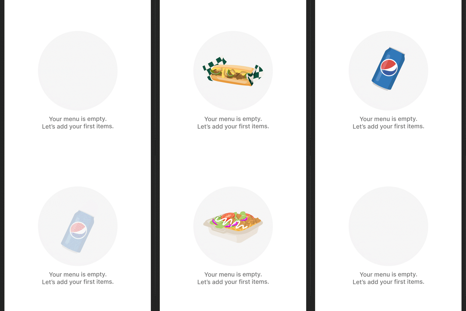
Medium Gray
(Secondary Text & Empty States)
Used for empty-state CTAs to communicate inactive or informational states. Also used for label text to establish hierarchy.
Typography — Type Hierarchy

Typography — Type Hierarchy
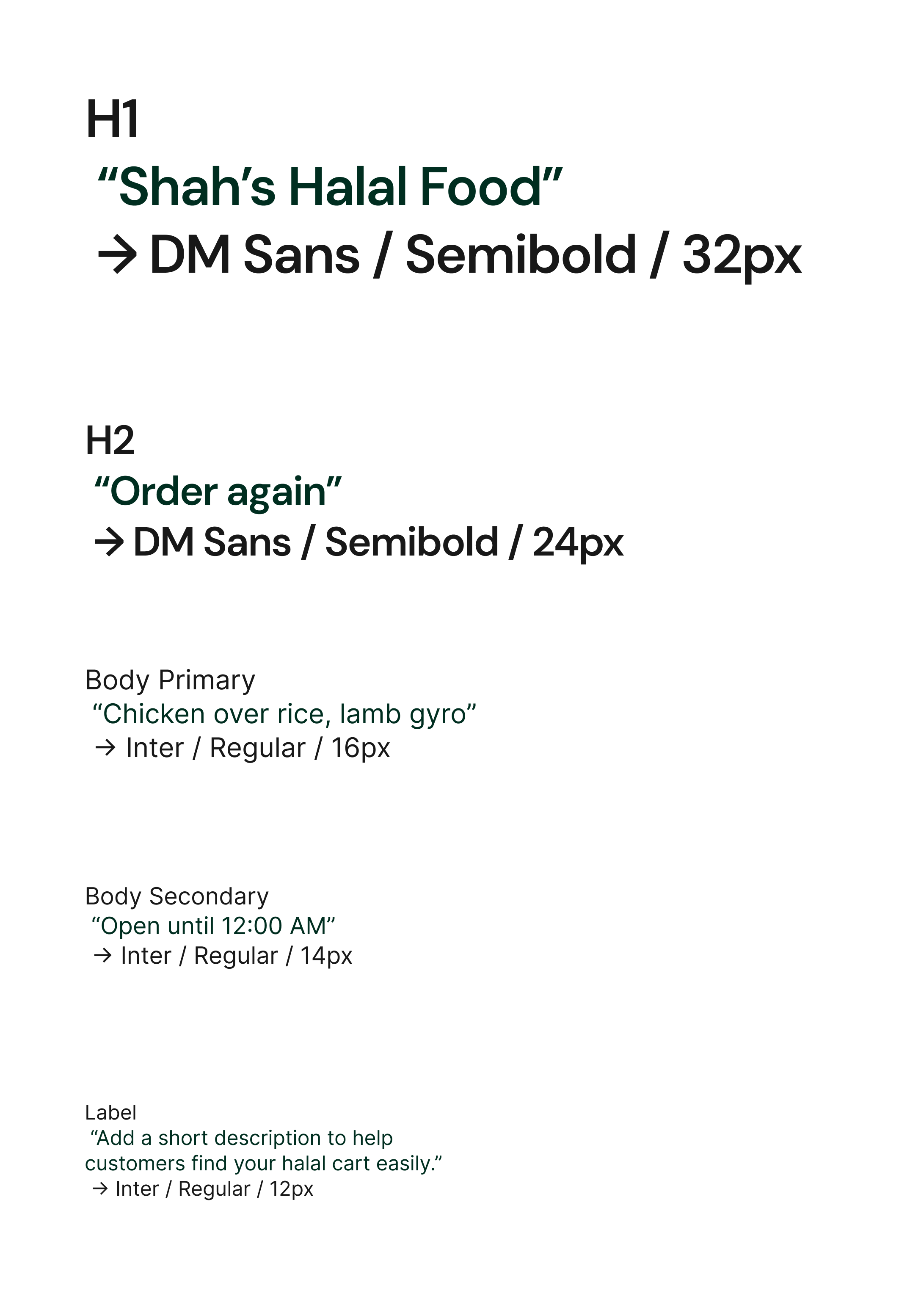
Typography — Functional Text Styles
-
Navigation labels
-
Button text
-
Tooltips
-
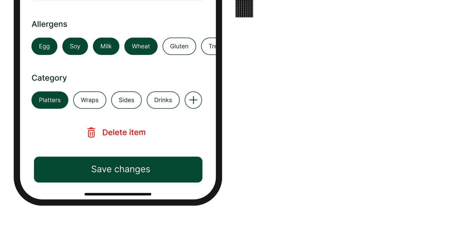
Filter chips
Text sizes and contrast were selected to remain readable in bright outdoor lighting and at arm’s-length viewing distances.
Accessibility considerations
Iconography — Navigation & actions
-

Menu
-

Cart
-

Notifications
-

Increase
-

Decrease
-

Walk time
-
Halal cart pin
Iconography — Allergen icons
-

Dairy
-

Eggs
-

Soy
-

Wheat
-

Sesame
Iconography — Icons in context
-
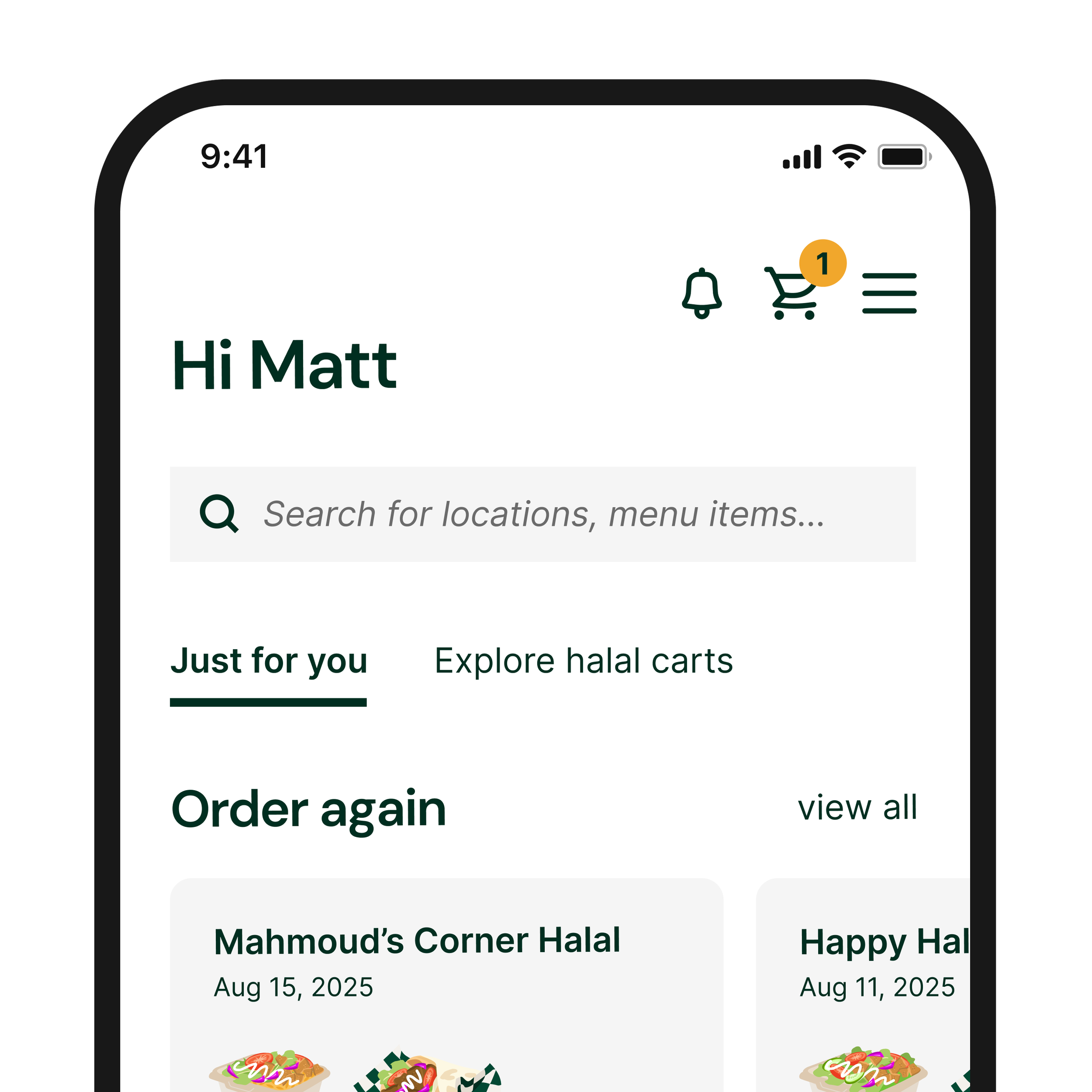
Home screen
Cart, notification, and menu icons
-
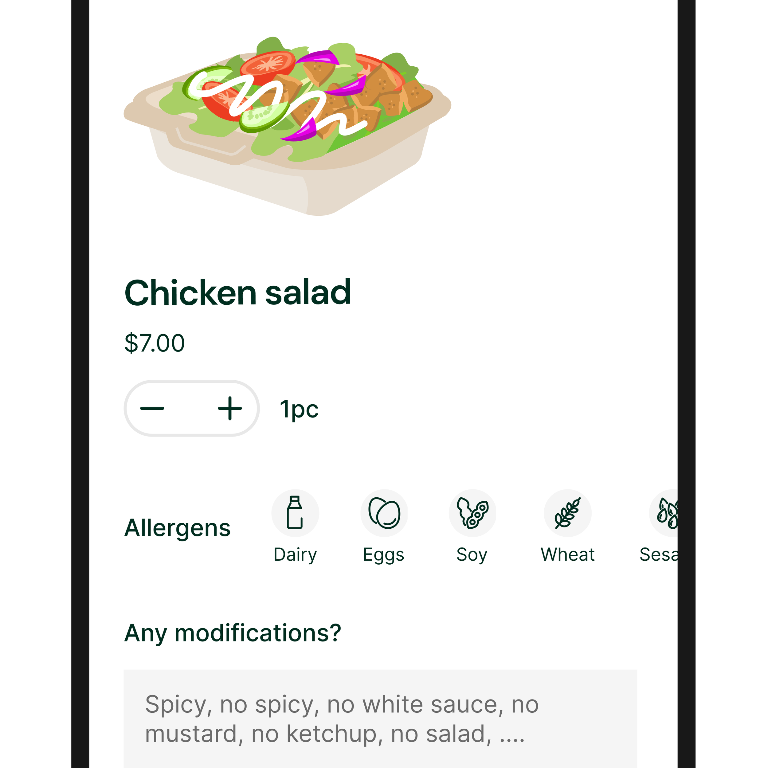
Food menu item
Allergen, increase, and decrease icons
-
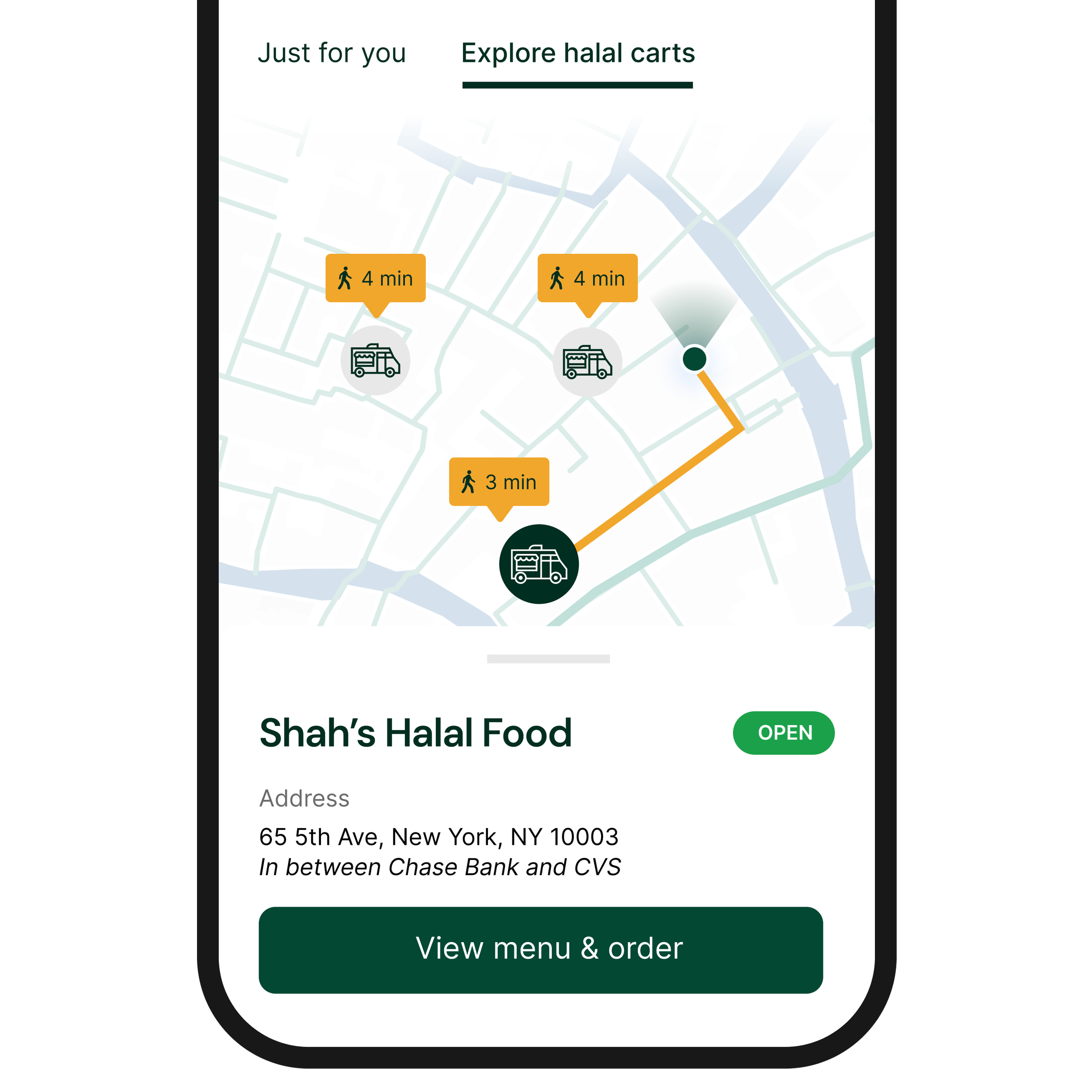
Map view
Halal cart pins, walking time icon
Buttons & CTAs
-

Primary actions
Used for the most important actions on each screen
-

Secondary actions
Supports alternative paths without competing with the main task
-

Destructive actions
Styled as icon + text to clearly signal risk without overemphasizing destructive actions.
-
Gesture-based actions
Prevents accidental taps and reinforces deliberate order completion.
-

Disabled states
Indicates required steps are incomplete.
Buttons & CTAs — Actions in context
-
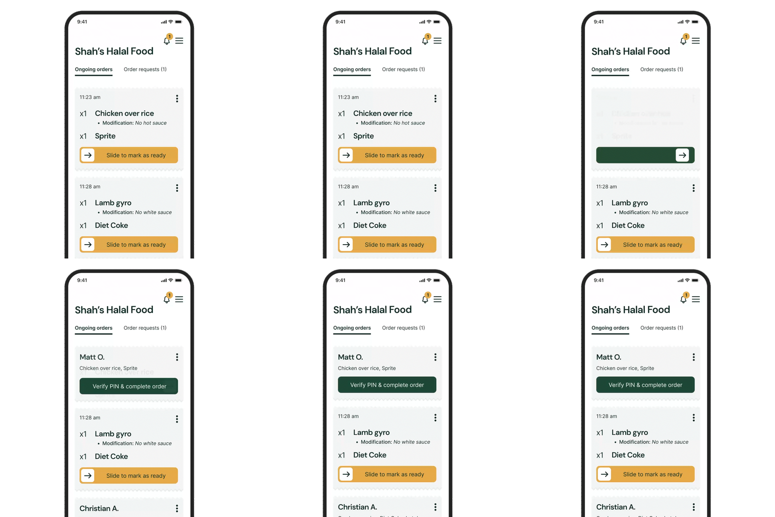
Vendor order card
-
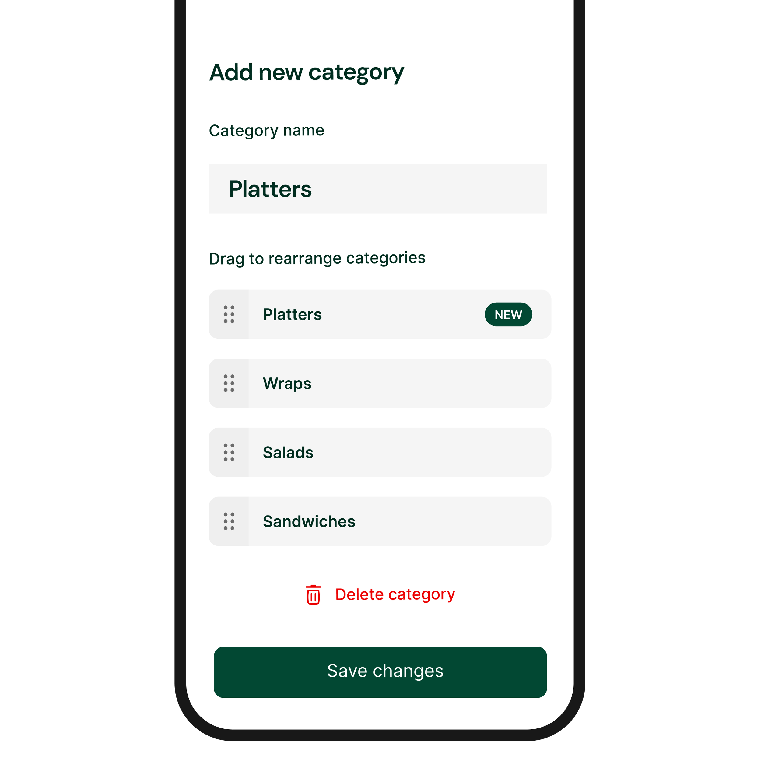
Menu editor
-
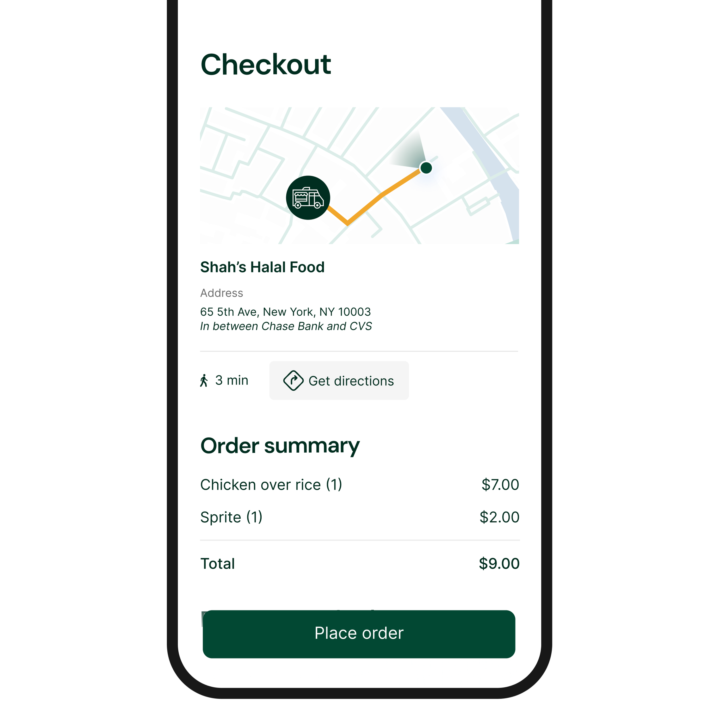
Checkout screen
Cards & Containers
-
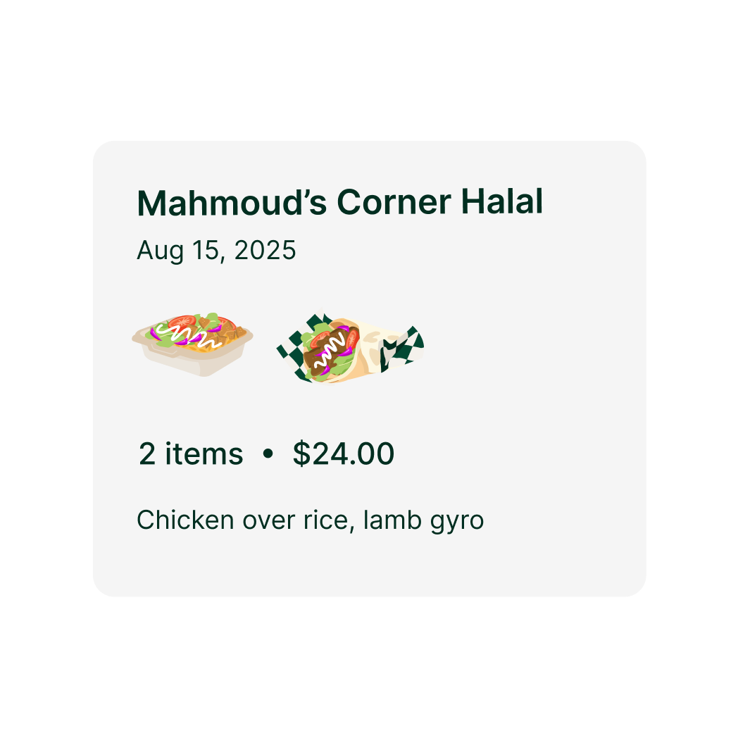
Order Again Card (Customer)
-
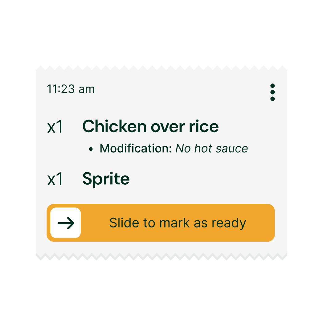
Order Card (Vendor)
-
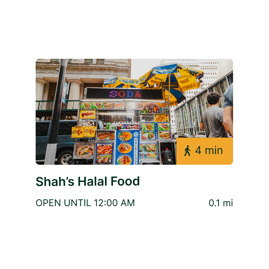
Halal Cart Card (Discovery)
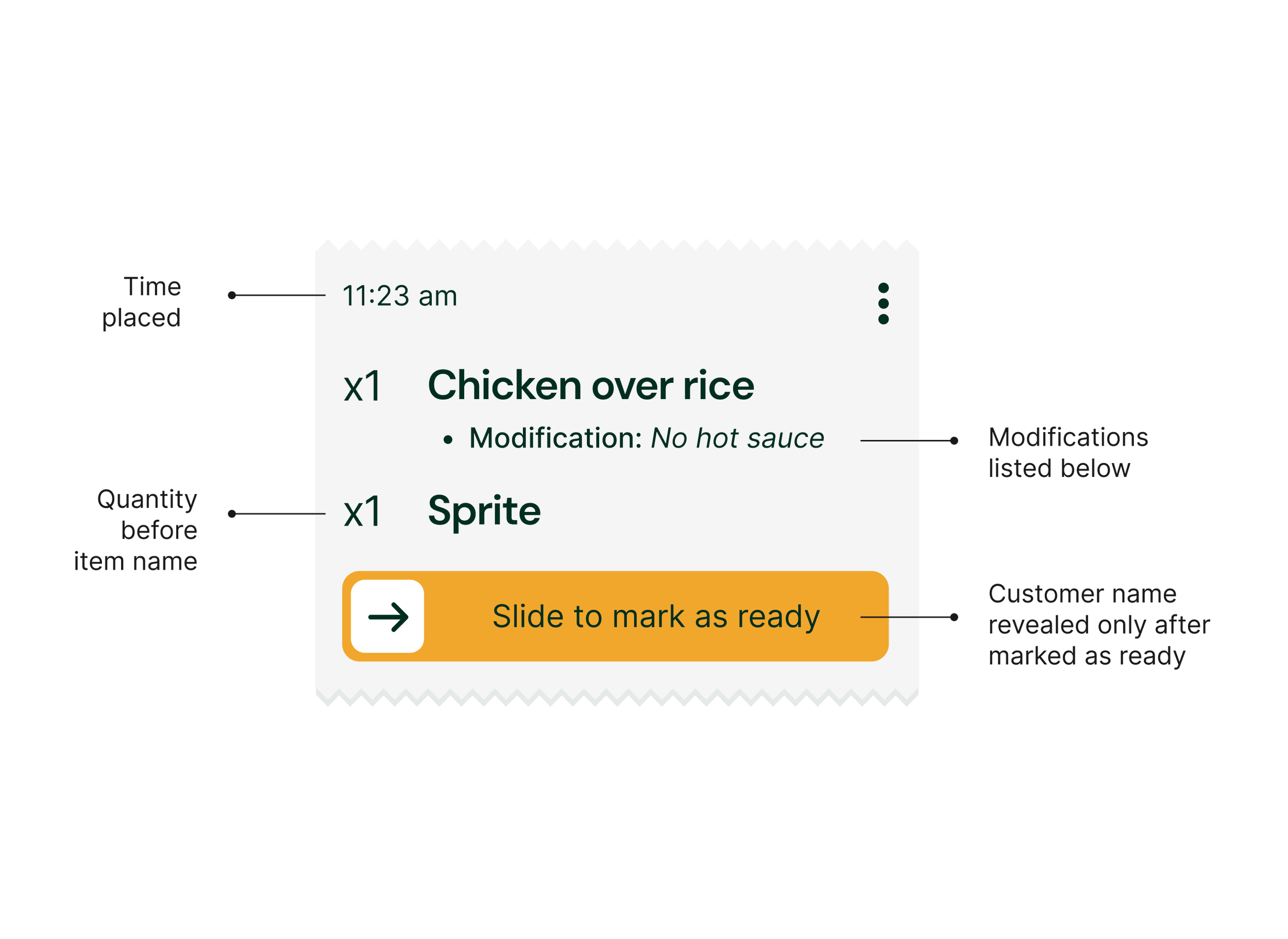
Cards & Containers — Hierarchy by task
Card layouts mirror real-world order tickets, helping vendors prioritize and prepare orders quickly during busy periods.
Cards & Containers — Cards in context
-
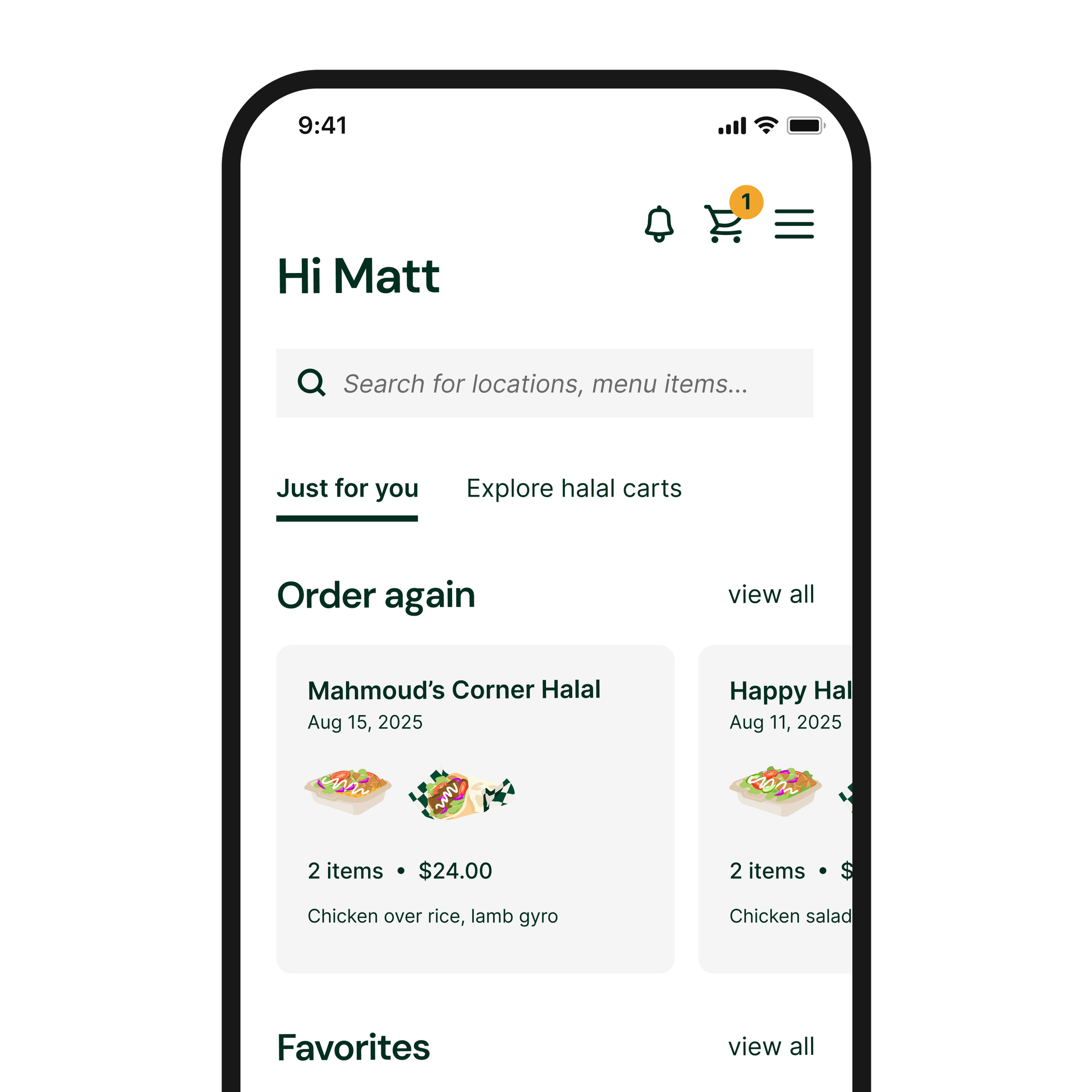
Order Again Card (Customer)
-
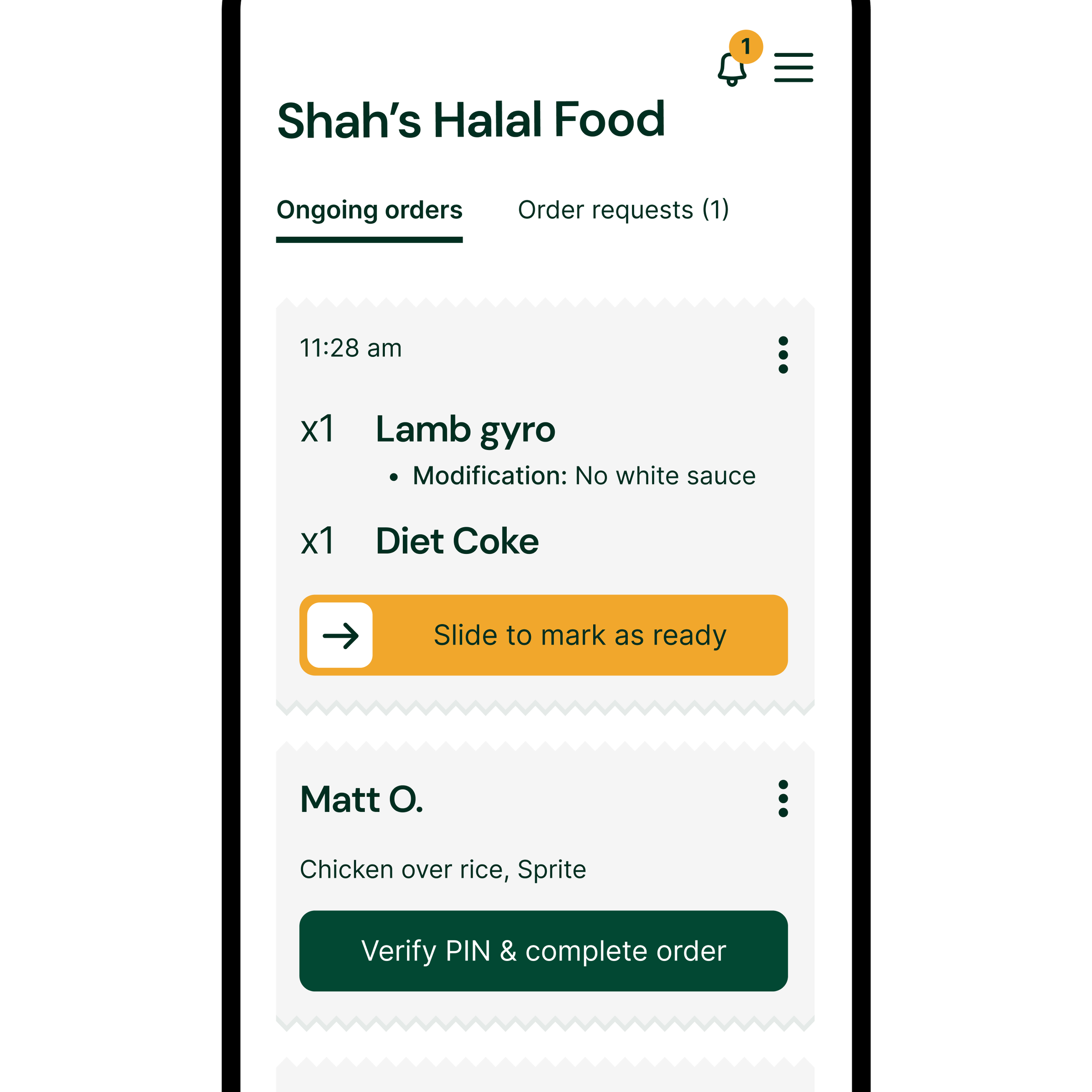
Order Card (Vendor)
-
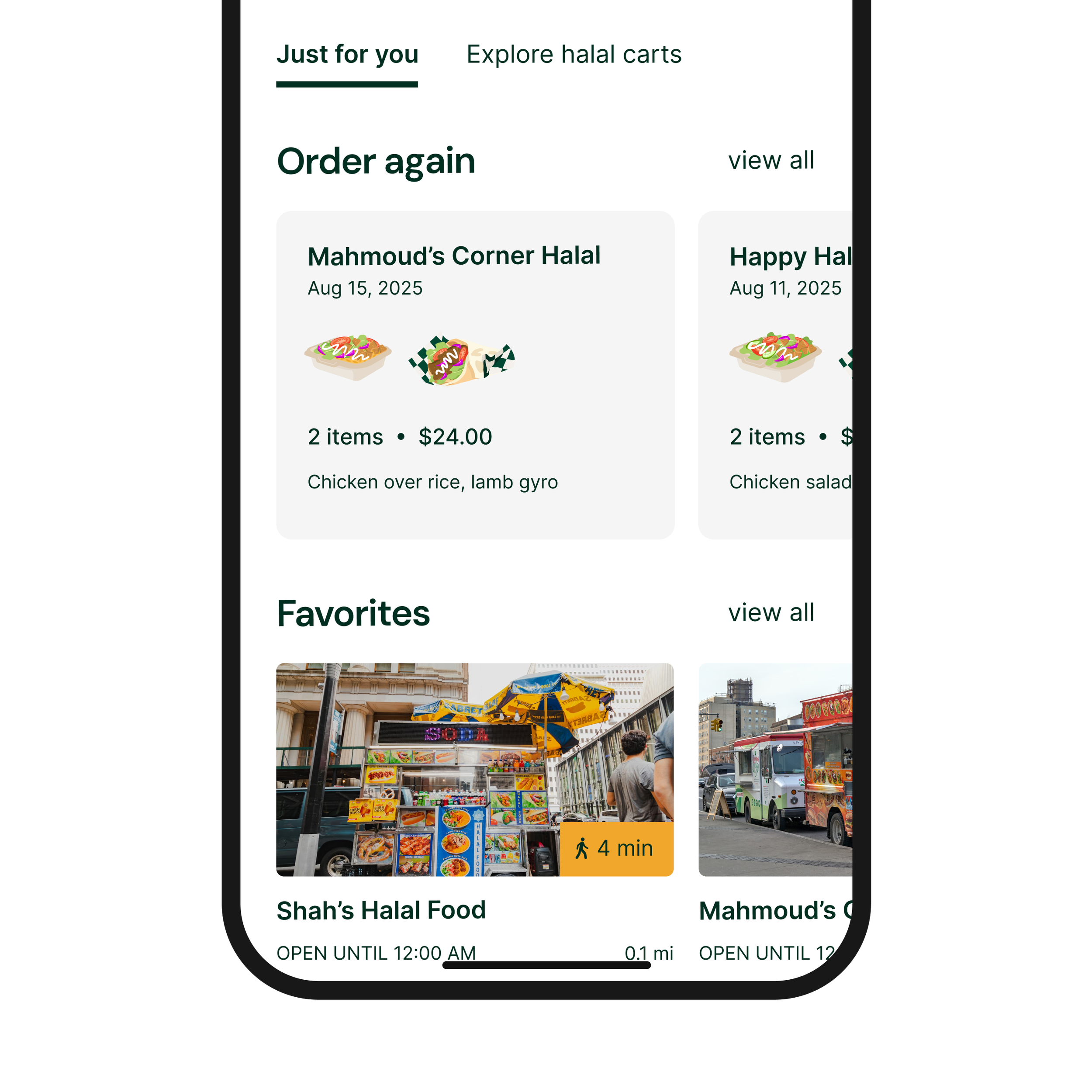
Halal Cart Card (Discovery)
07
Illustration system
Illustrations use vibrant, solid colors to reflect the richness and warmth of halal food culture and make menu items feel enticing rather than transactional. Soft, organic shapes create a friendly and approachable tone for both customers and vendors.
While the style is non-photorealistic, food proportions and silhouettes remain realistic to ensure items are still recognizable and trustworthy as menu representations. This avoids the inconsistency and quality issues that can come from vendor-uploaded photos while maintaining visual clarity.
Halal green is intentionally integrated into the illustrations—such as in napkins and packaging elements—to reinforce brand identity and connect the visuals back to halal symbolism. Solid colors are used instead of gradients to keep the system bold, consistent, and scalable across different screens and states.
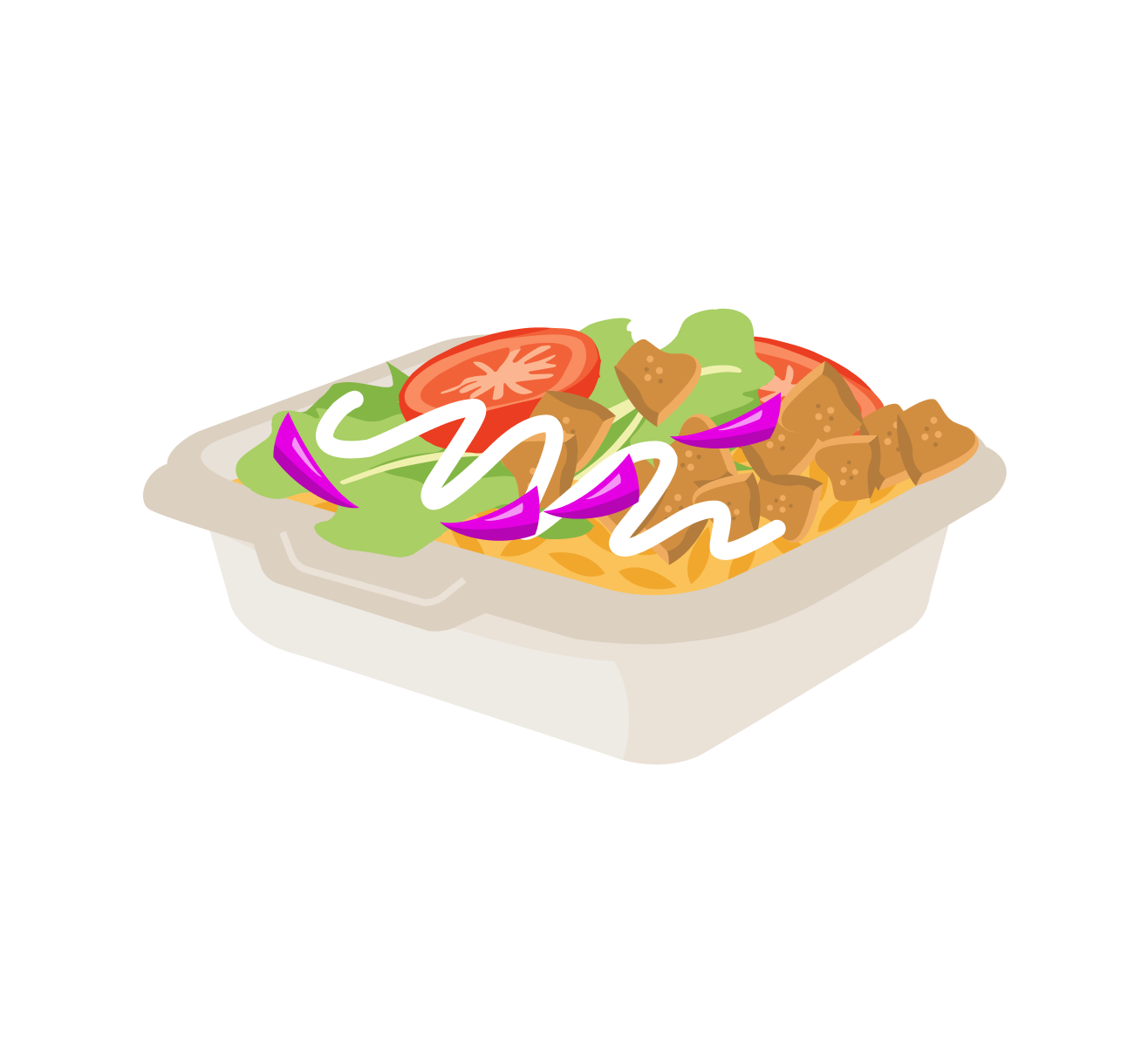
Chicken over rice
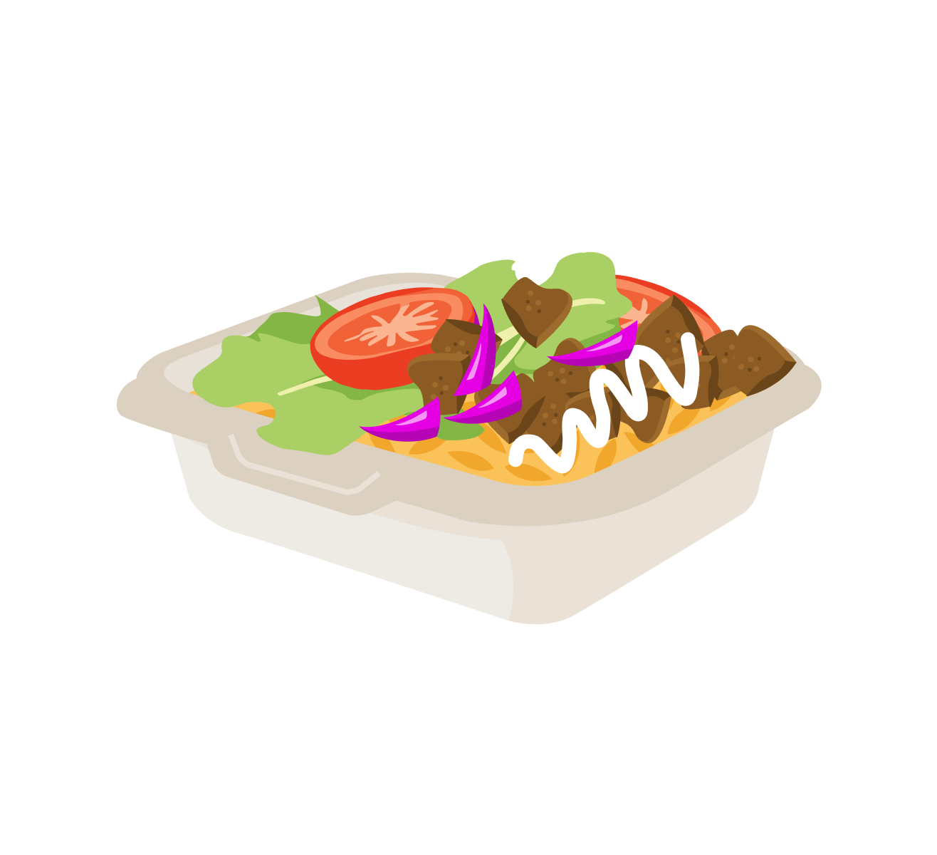
Lamb over rice
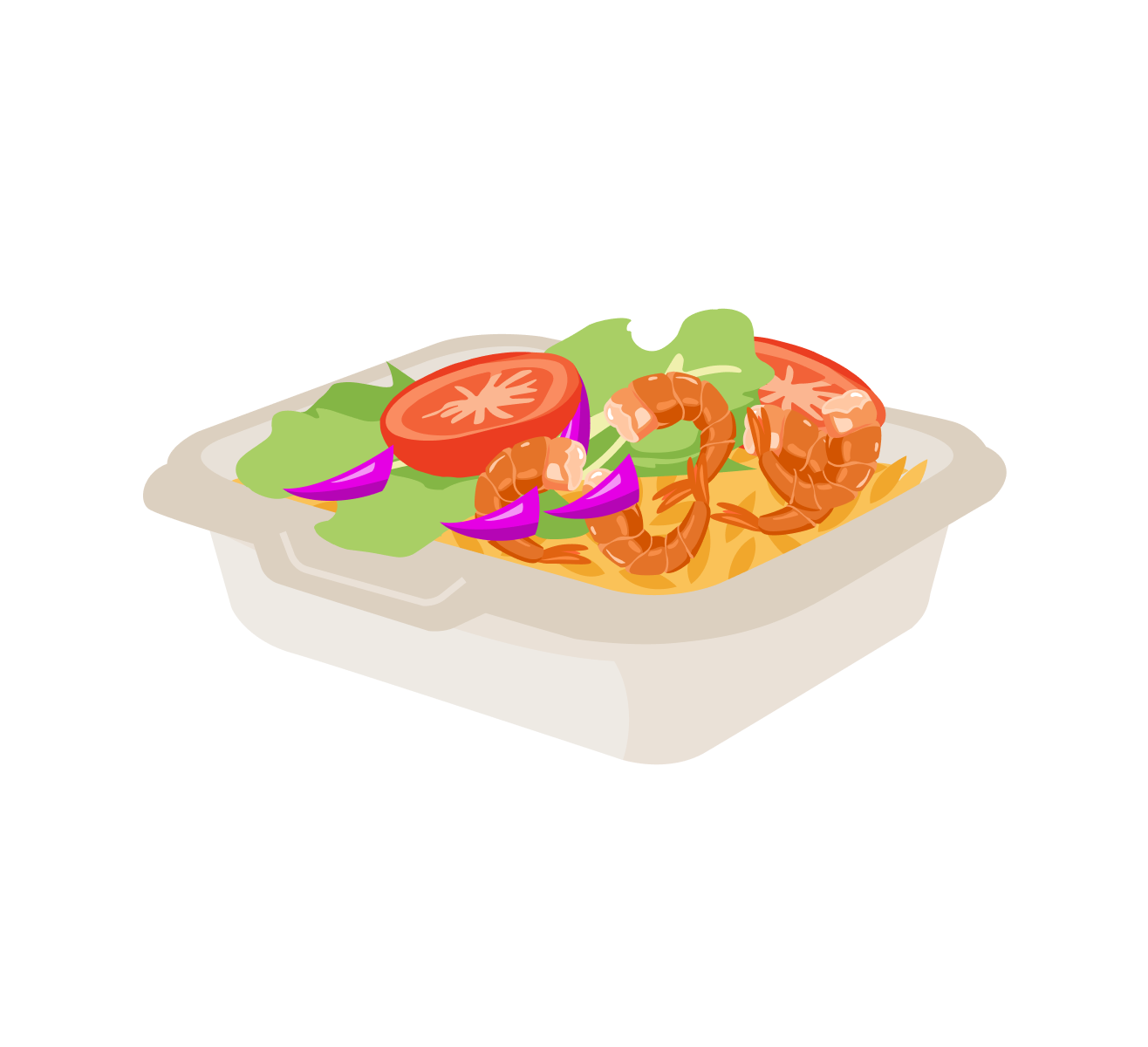
Shrimp over rice
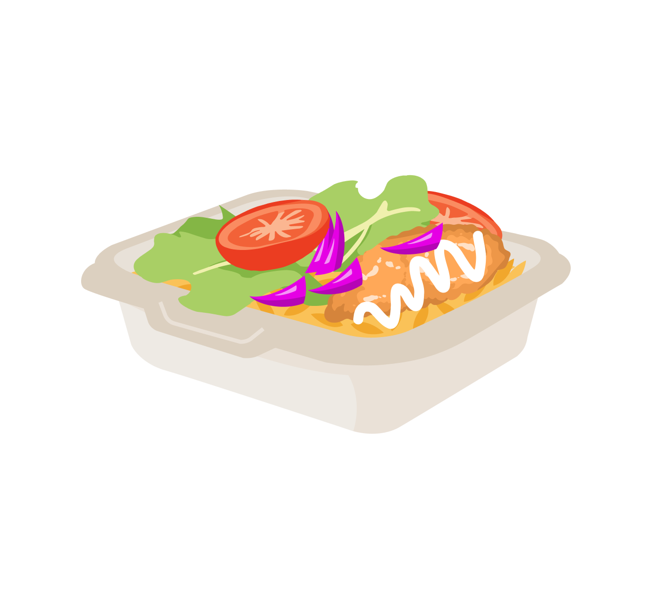
Fish over rice
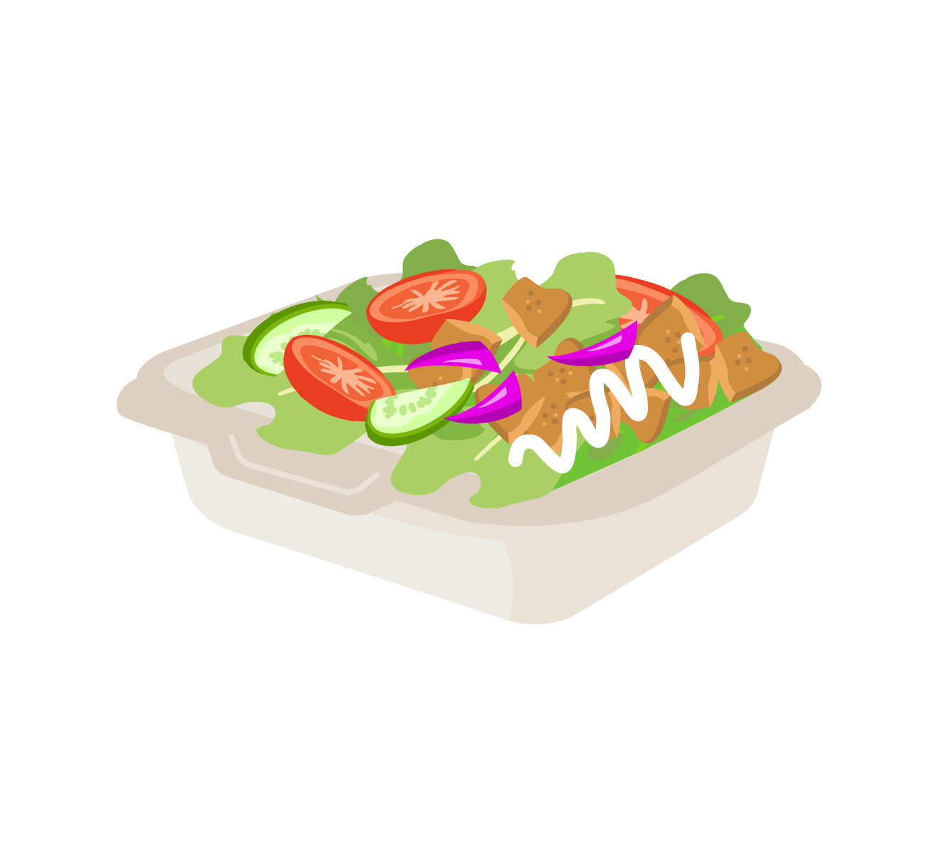
Chicken salad
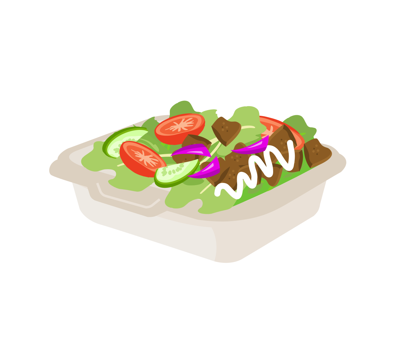
Lamb salad
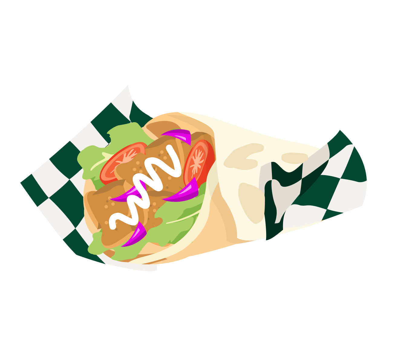
Chicken gyro
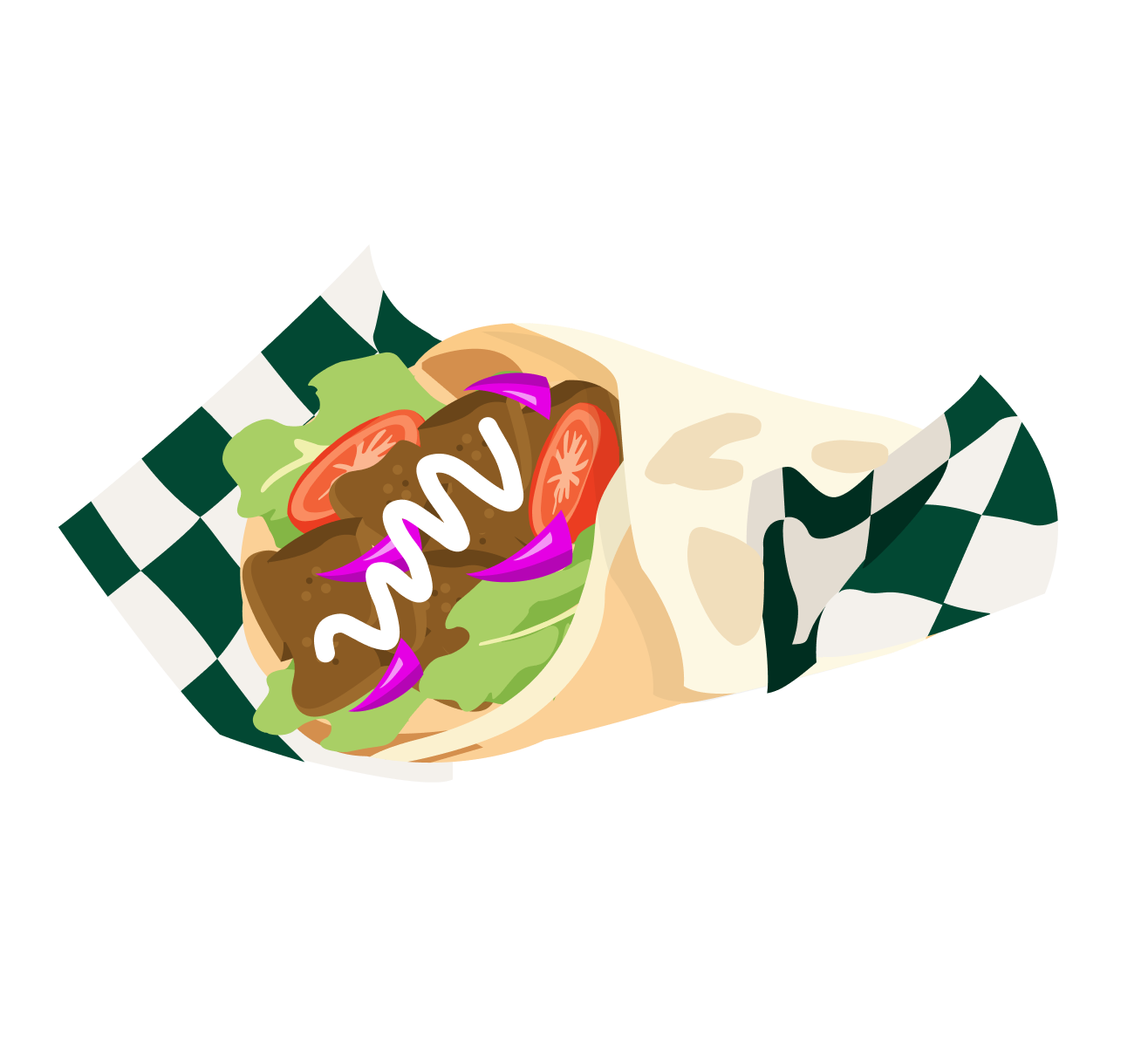
Lamb gyro

Hot dog
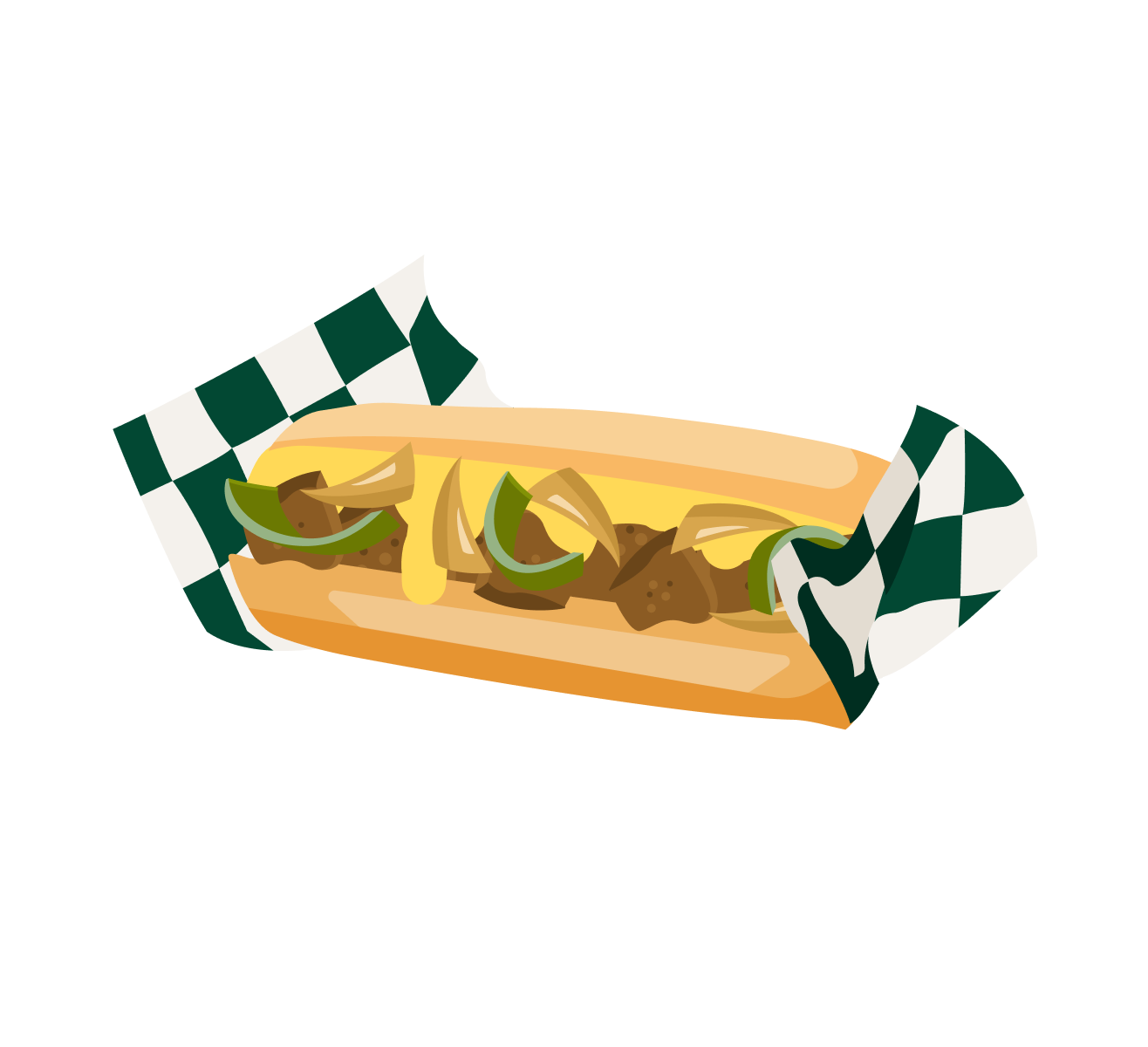
Philly cheeseteak

French fries

Coke

Diet Coke

Sprite

Pepsi

Dr Pepper

Fanta
Root beer

Bottled water

Gatorade red

Gatorade orange

Gatorade blue

Gatorade yellow
08
Motion design system
-
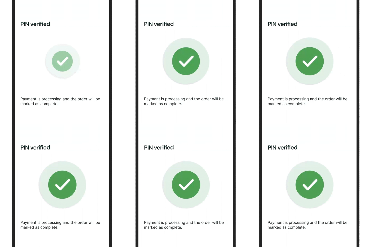
Confirmation animation (Vendor)
Vendor-facing animations are intentionally calm and minimal to support focus during busy preparation periods.
All completion animations play once and then resolve into a static state, signaling finality and preventing confusion about whether an action is still in progress. Looping and bounce effects are avoided to reduce visual noise and maintain a sense of trust and control.
-
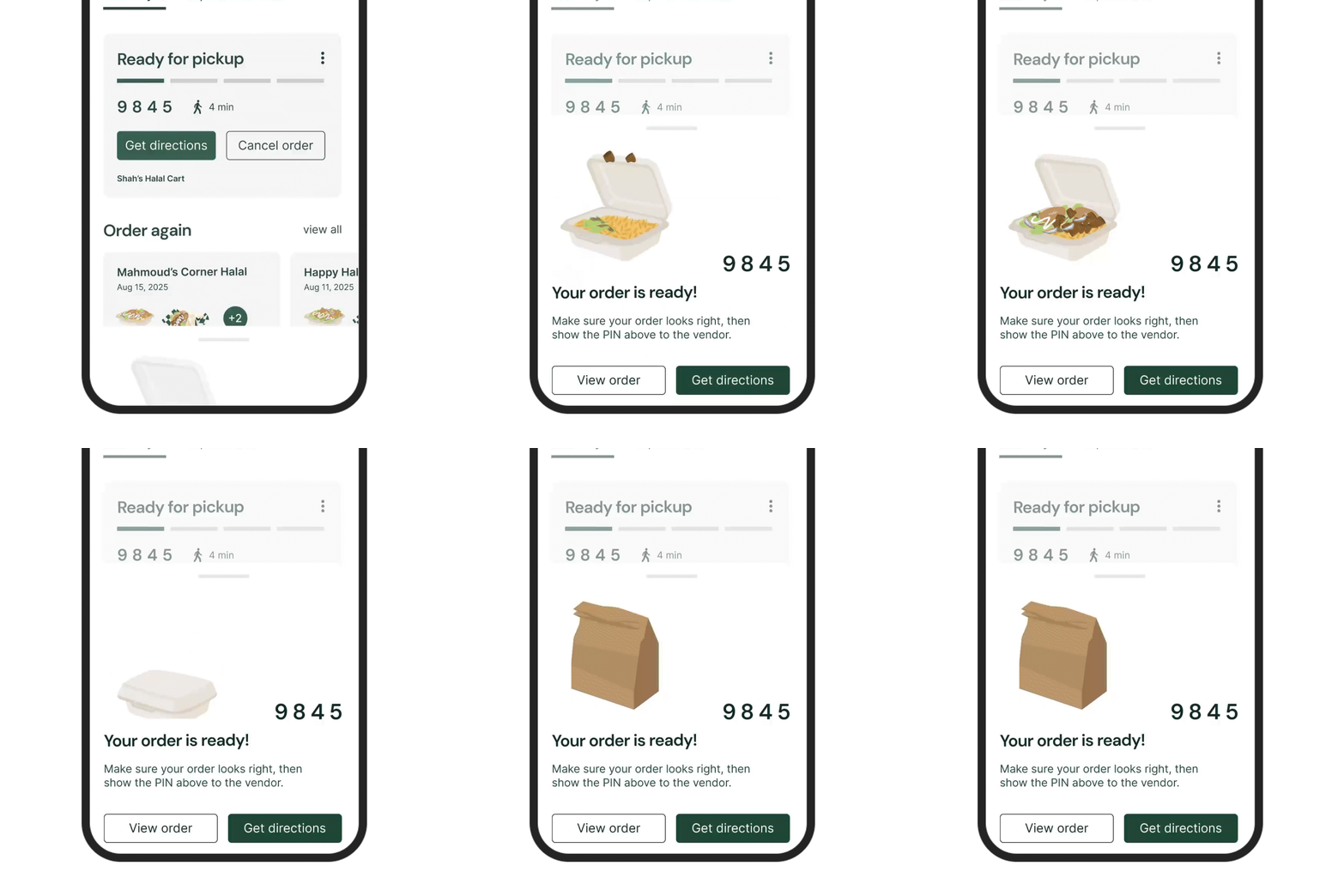
Confirmation animation (Customer)
Customer-facing animations are slightly more expressive to create moments of delight around ordering and pickup, without disrupting flow.
All completion animations play once and then resolve into a static state, signaling finality and preventing confusion about whether an action is still in progress.
-
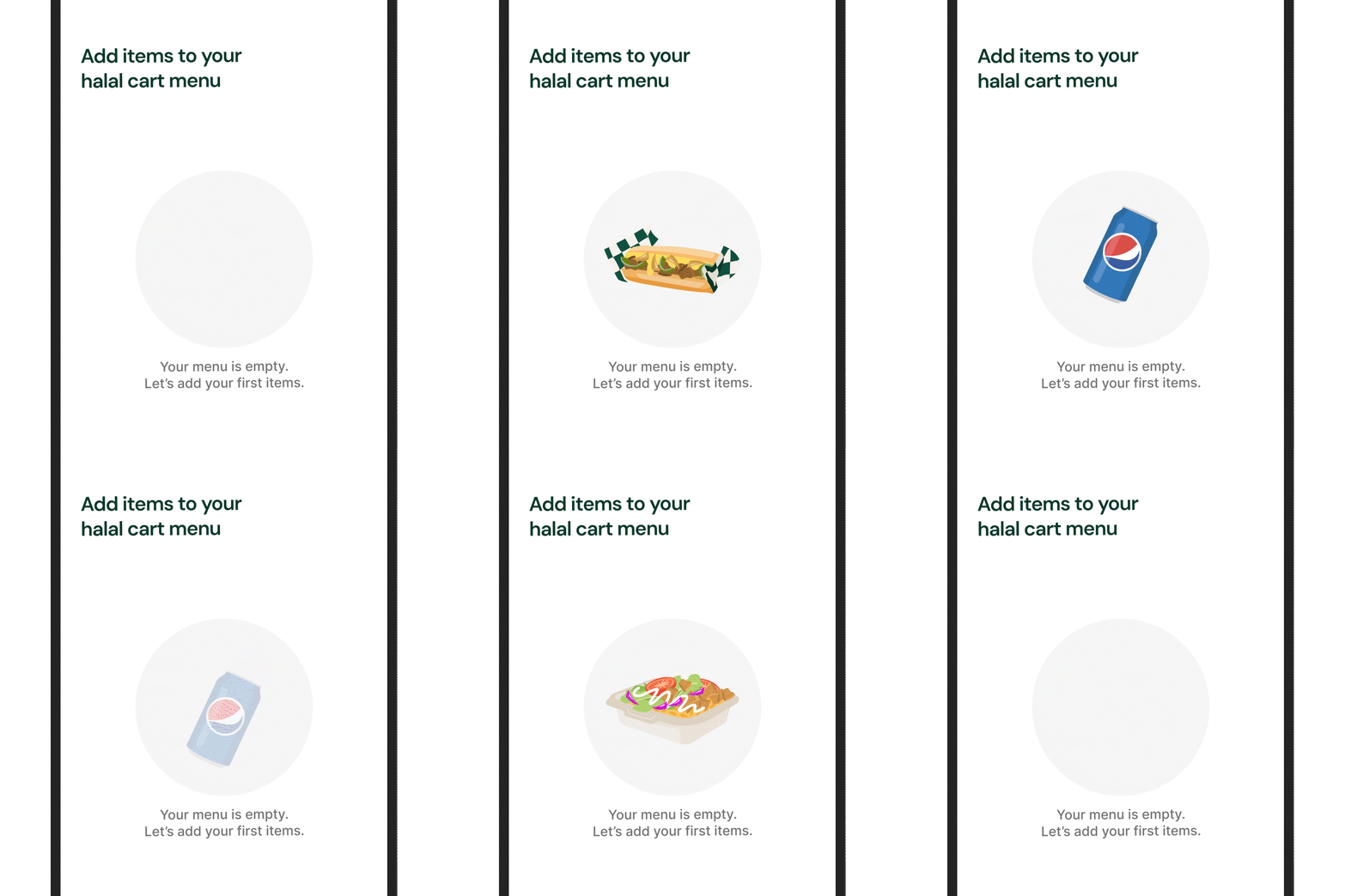
Empty state animation
Motion is also used in empty states and transitions to guide attention and encourage action while remaining subtle enough to keep the interface clear and scannable in real-world, fast-paced environments.
-
Slide to mark as ready
A deliberate gesture prevents accidental taps and reinforces order completion.
09
Exploration & iteration
1. Testing Methods (How designs were evaluated)
Usability testing
Contextual inquiry / field observation
Informal interviews
Concept testing
Heuristic evaluation
Cognitive load testing (informal)
Design critiques
These methods were used iteratively across both customer and vendor experiences to validate flows, reduce confusion, and improve clarity.
2. The following parts of the app went through design iteration:
Customer homepage
“Order is cooking” / processing state
Vendor new order request screen
Vendor homepage / dashboard
Customer Homepage
-
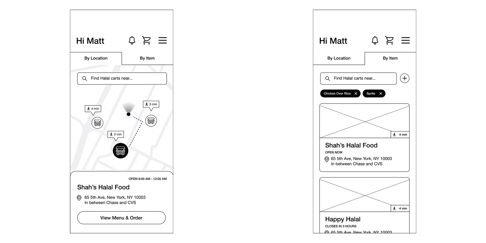
Before
-
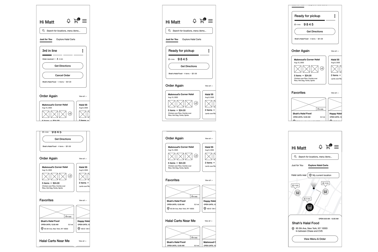
After
-
Problem observed
Users struggled to quickly understand their order status and nearby cart availability. During testing, they also prioritized quick access to past orders and saved/favorite carts, rather than relying solely on search or location-based discovery. Additionally, relying on notifications to check order status felt inconvenient—users expected a visible, persistent tracker on the homepage.What changed
The information hierarchy was redesigned to prioritize real-time order status, followed by quick access to saved/favorite carts and nearby carts with clear open/closed indicators, making key information immediately visible at a glance.Why it mattered
Reduced cognitive load and made the homepage useful both for discovery and active orders.Methods used:
Usability testing · Informal interviews · Cognitive load testing
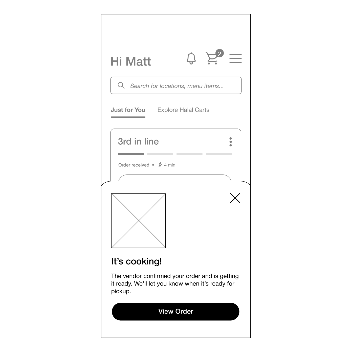
“Your Order Is Cooking” → Popup
-
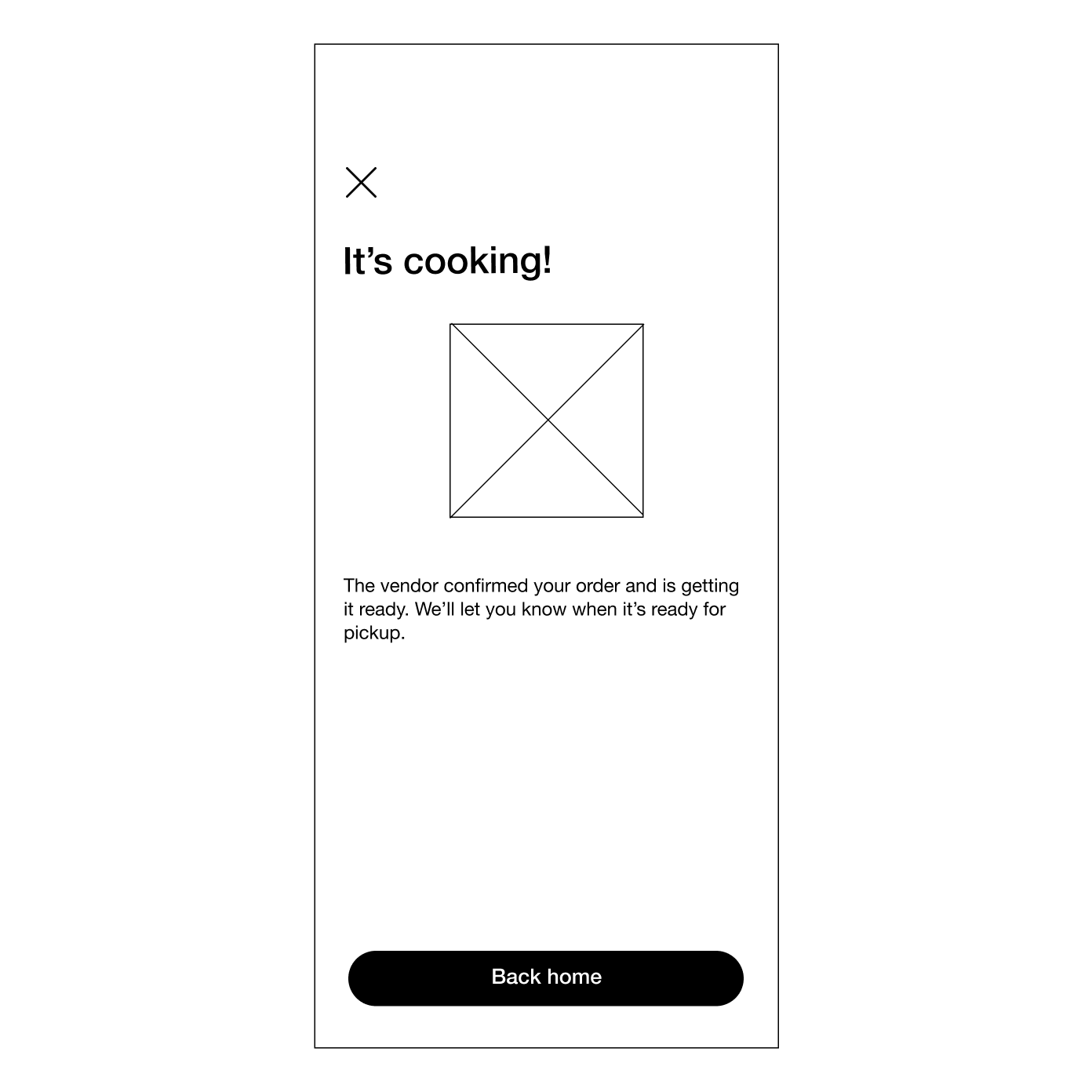
Before
-
After
-
Problem observed
A full-screen waiting state interrupted navigation and made users feel blocked from other actions.What changed
The cooking state was redesigned as a persistent popup on the homepage instead of a separate screen.Why it mattered
Maintained visibility of order progress while allowing users to continue browsing and orienting themselves.Methods used:
Concept testing · Usability testing · Design critique
Vendor New Order Request Screen
-
Before
-
After
-
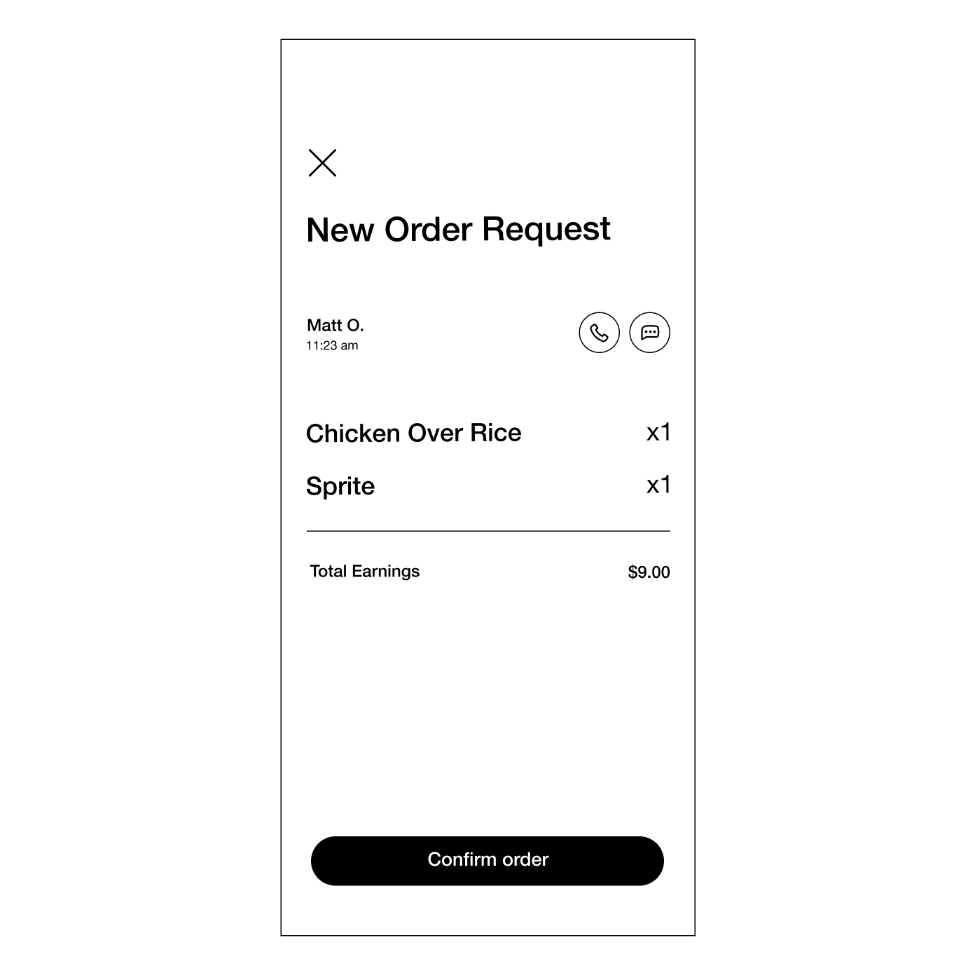
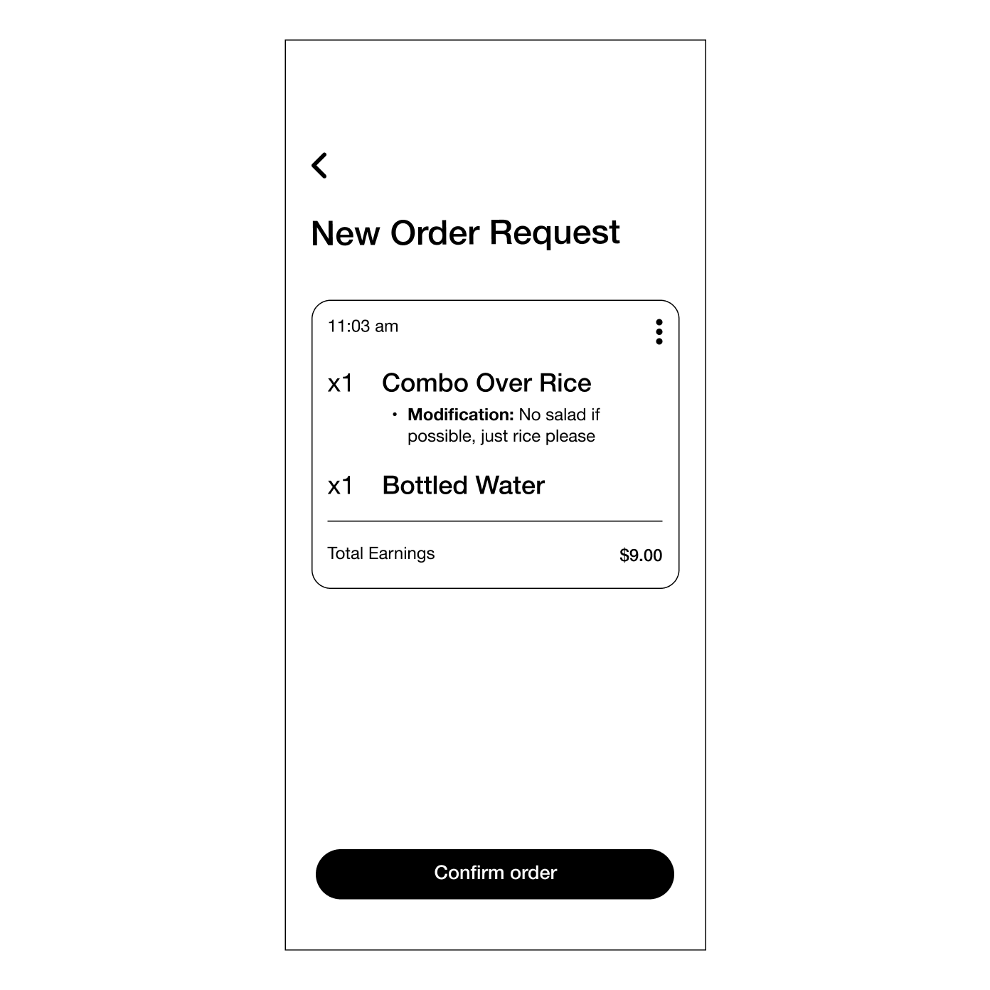
Problem observed
Vendors needed to quickly scan and understand incoming orders within a fast-paced, high-pressure environment. Early layouts required too much reading, making it harder to grasp what needed to be prepared at a glance.What changed
The layout was restructured to prioritize order details—items, quantities, and customizations—over the customer’s name, aligning the interface with the vendor’s immediate task of food preparation.Why it mattered
This reduced the time needed to assess each order, helping vendors quickly determine ingredient availability, identify potential issues (e.g. out-of-stock items), and take action (notifying the customer to see if they’d like another item/cancel the order) without slowing down their workflow.Methods used:
Contextual inquiry · Usability testing · Heuristic evaluation
Vendor Dashboard
-
Before
-
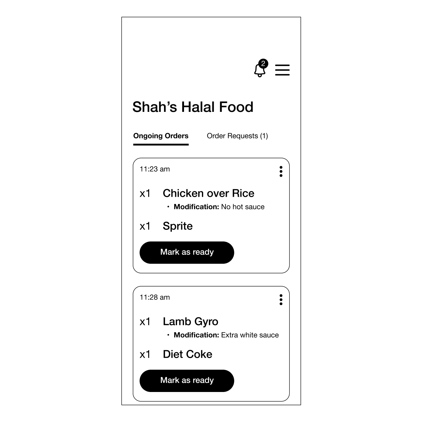
After
-
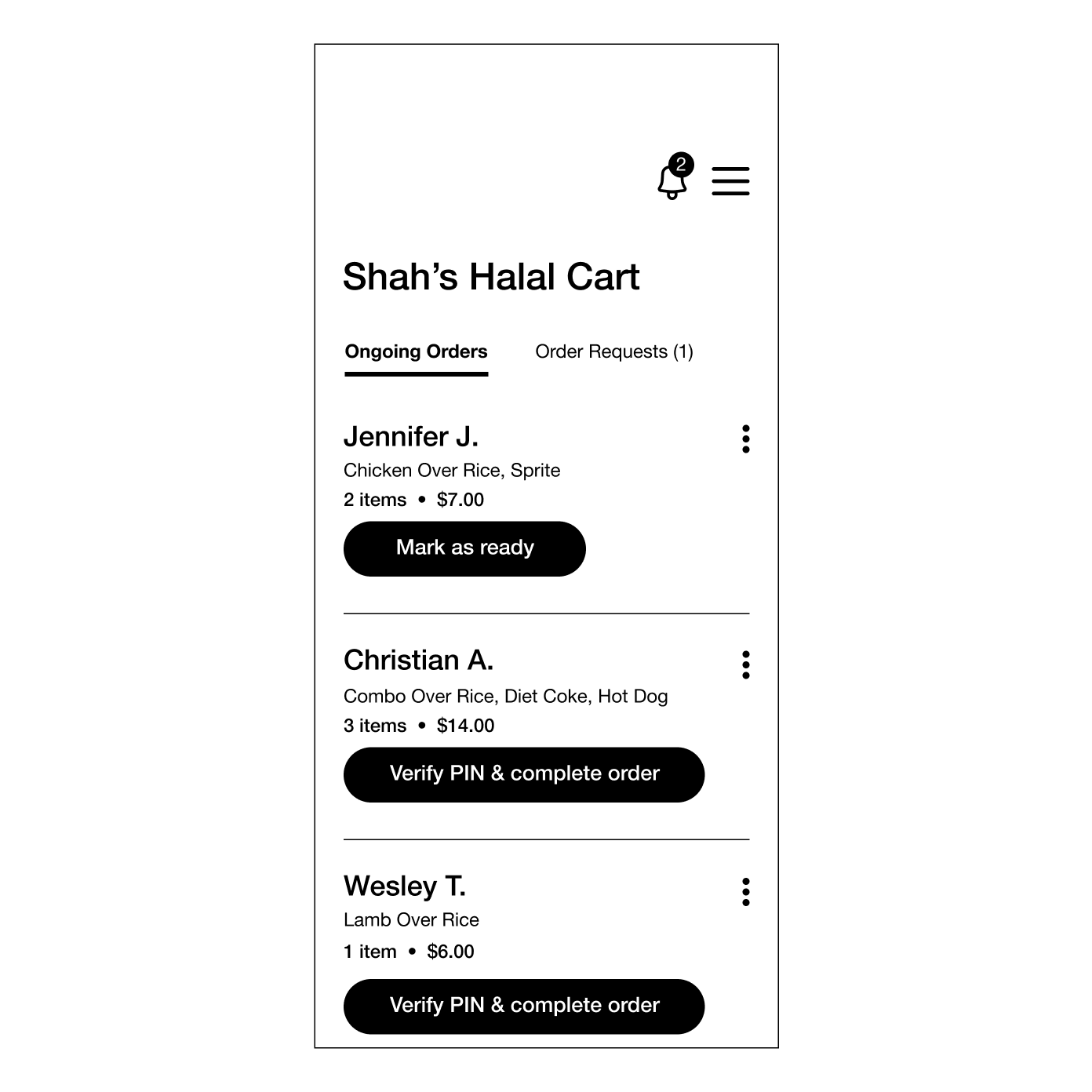
Problem observed
Early layouts required vendors to read through multiple details to determine which orders to prioritize, slowing them down during busy periods.What changed
The dashboard was redesigned to emphasize timestamp, quantity, and item names (mirroring how restaurant order tickets are structured) while customer names were deprioritized until orders are marked as ready for pickup.Why it mattered
This aligned the interface with real-world preparation workflows, enabling faster scanning and more efficient prioritization under time pressure.Methods used:
Field observation · Cognitive load testing · Design critique
10
Reflection & what’s next
Designing HalalGo reinforced the importance of building for real-world constraints, especially for mobile vendors operating in fast-paced, outdoor environments. Prioritizing clarity, flexible workflows, and purposeful motion helped ensure the experience remained usable under pressure.
This project also highlighted how small UX decisions—such as how order information is structured, how empty states guide action, or how motion communicates completion—can significantly impact user confidence and efficiency.
Balancing the needs of both vendors and customers required thoughtful system design, ensuring that choices made in one experience (like menu creation or illustration standards) positively influenced the other.
What I’d explore next
Vendor performance insights
1
Adding lightweight analytics to help vendors understand peak hours, best-selling items, and customer trends.
Customer loyalty features
2
Exploring reward systems or personalized recommendations to strengthen repeat engagement.
Accessibility improvements
3
Further refining contrast, motion preferences, and text sizing to support a wider range of users.
Real-world testing
4
Conducting usability tests with actual halal cart operators and customers to validate assumptions and uncover new opportunities.
HalalGo was an opportunity to explore how thoughtful product design can improve everyday experiences for both small business owners and their customers: through clarity, trust, and intentional interaction design.
Closing note