

Lime Website
A redesign of Lime's official website, translating its bold brand identity into a refined, trustworthy, and people-first digital experience for a diverse range of audiences.
Role
Designer
Responsibilities
Web design · Visual design · Branding ·
Information design · Engineering collaboration
4 months
Duration
Team
Team
-
Creative Director
Jane Chung -
Designer
Valerie Trisnadi -
Experience Lead
Kyle Cotter -
Developer
Rob McFadden
-
Creative Director
Jane Chung -
Designer
Valerie Trisnadi -
Experience Lead
Kyle Cotter -
Developer
Rob McFadden

Following Lime's rebrand in 2020, the company redesigned its official website to better reflect its evolving brand. I partnered with our Creative Director on the redesign and collaborated closely with engineering to bring the experience to life.
Midway through the project, the Creative Director left the company. From that point forward, I became the primary design partner working directly with engineers through implementation and design, helping carry the project to launch.
How might we design a website that reflects Lime as a people-first, trustworthy brand while serving the needs of riders, cities, investors, and press?
Project context
My role
-

Co-designed Lime's official responsive website
-
Owned the design of multiple webpages
-
Designed sections used across the site
-
Refined layouts, typography, and visual hierarchy
-
Worked directly with engineers throughout implementation
-
Solved responsive design challenges during development
-

Co-designed Lime's official responsive website
-
Owned the design of multiple webpages
-
Designed sections used across the site
-
Refined layouts, typography, and visual hierarchy
-
Worked directly with engineers throughout implementation
-
Solved responsive design challenges during development
Design challenge 1:
Elevating a distinctive brand color
Challenge
Lime's signature neon green is one of the company's most recognizable brand assets—and one that couldn't be altered. While it naturally conveys energy and optimism, the challenge was finding the right visual balance as it is weaved into the website design. Our goal was to create a premium digital experience that felt refined, trustworthy, and editorial, all while still keeping this bold color at the center of the brand.

Lime neon green
#00dd00
Design decisions
Instead of relying on the green alone, we created contrast around it:
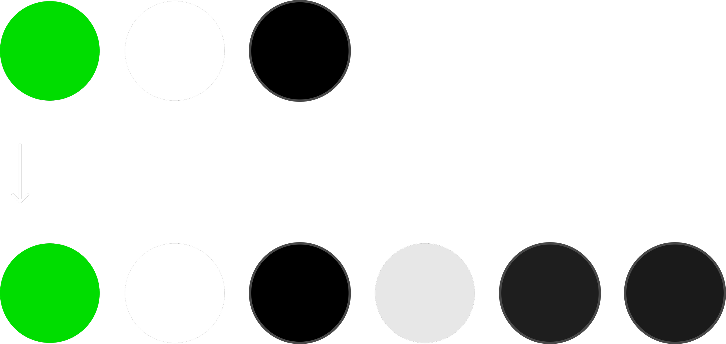
A. Expanded neutral palette
Rather than relying solely on black and white, we introduced multiple shades of charcoal and gray to create depth throughout the interface. These tonal layers softened the intensity of Lime's neon green while giving the website a more refined, editorial quality.
B. Building an editorial visual language
-
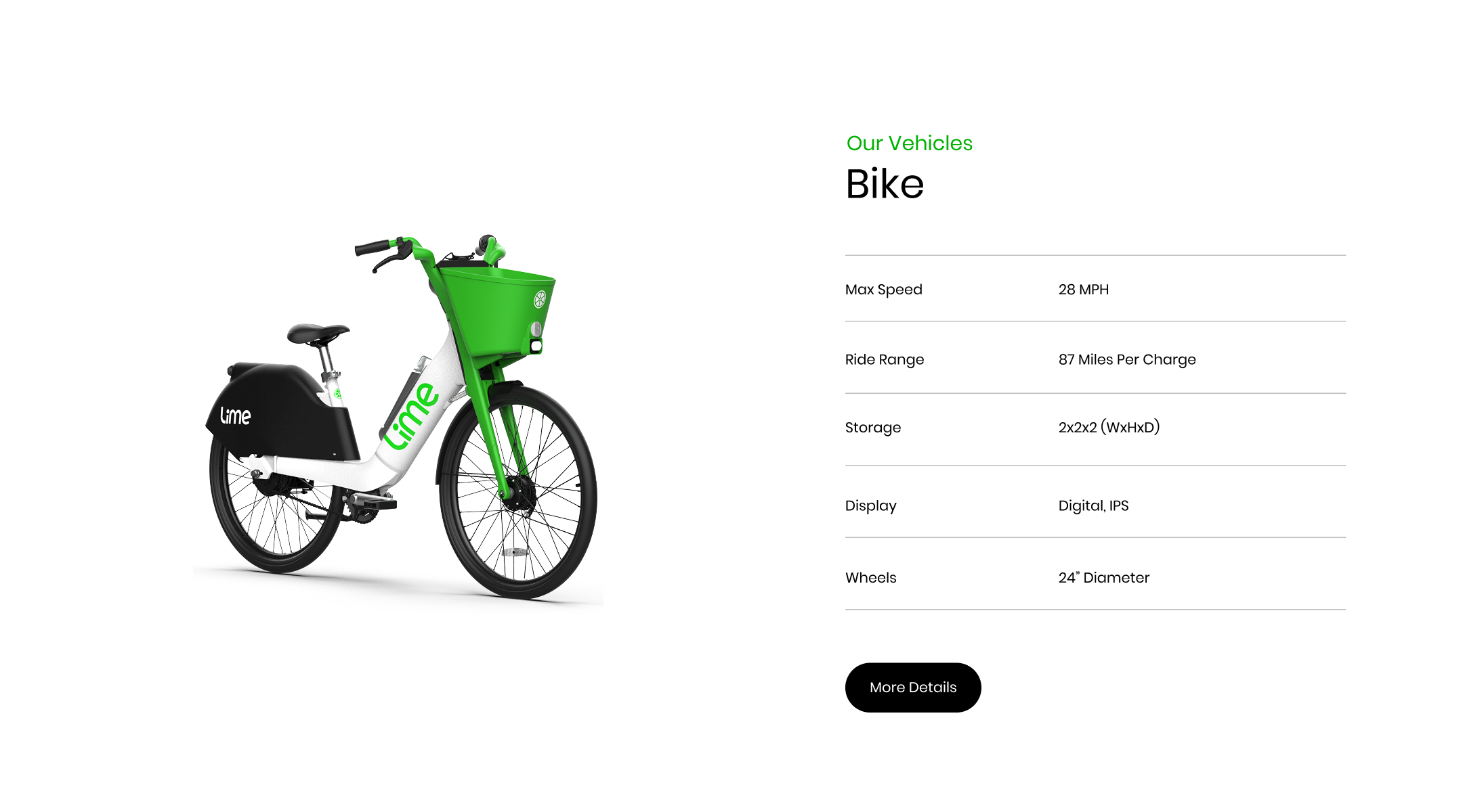
Thin dividing lines established structure and reinforced the editorial aesthetic.
-
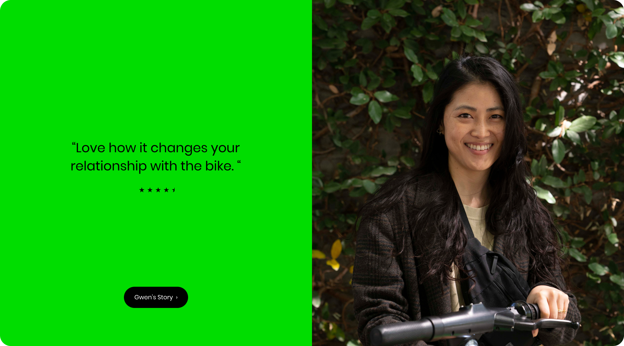
Generous whitespace gave content room to breathe.
-
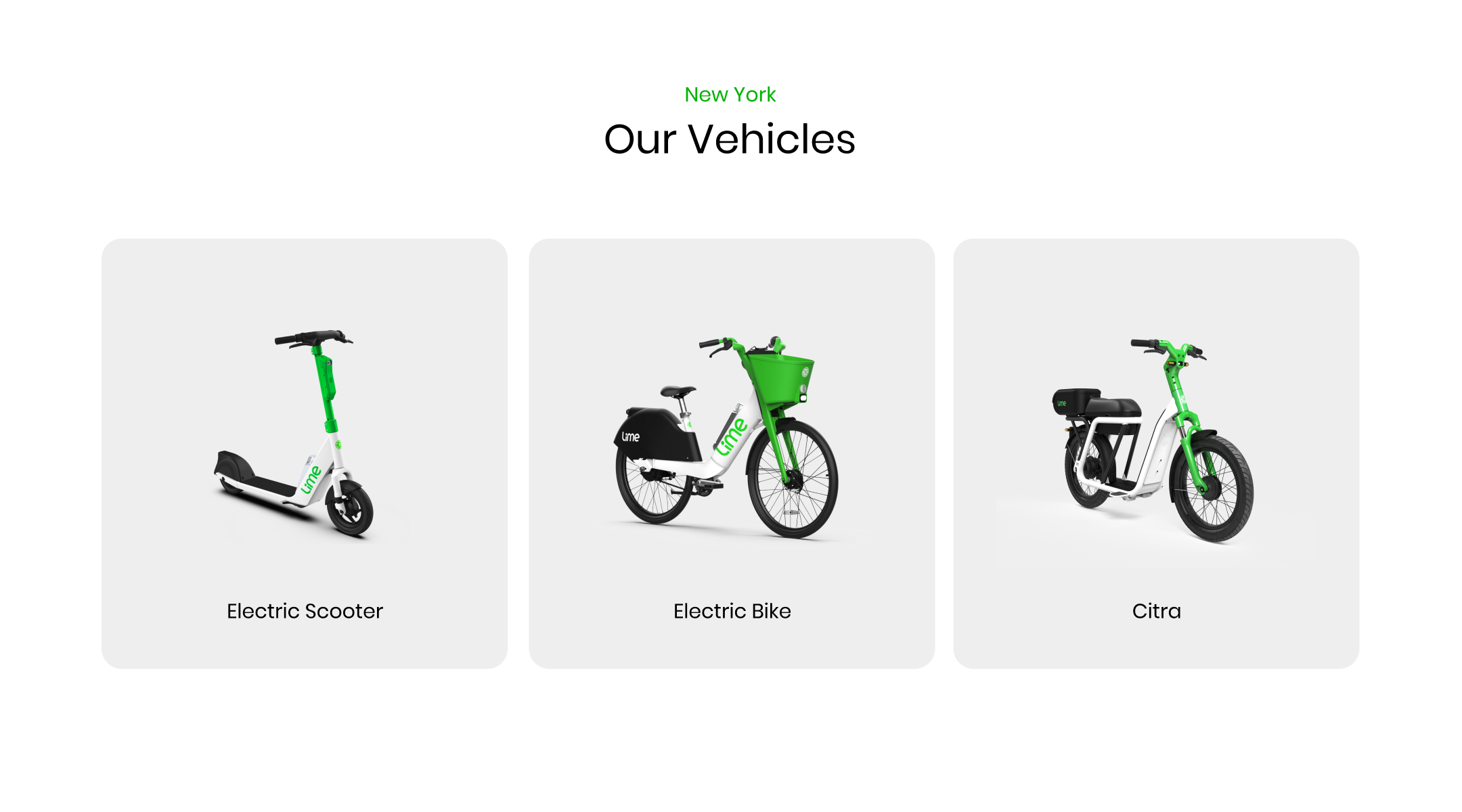
Emphasized typography and composition over decoration.
-
Thin dividing lines established structure and reinforced the editorial aesthetic.
-
Generous whitespace gave content room to breathe.
-
Emphasized typography and composition over decoration.
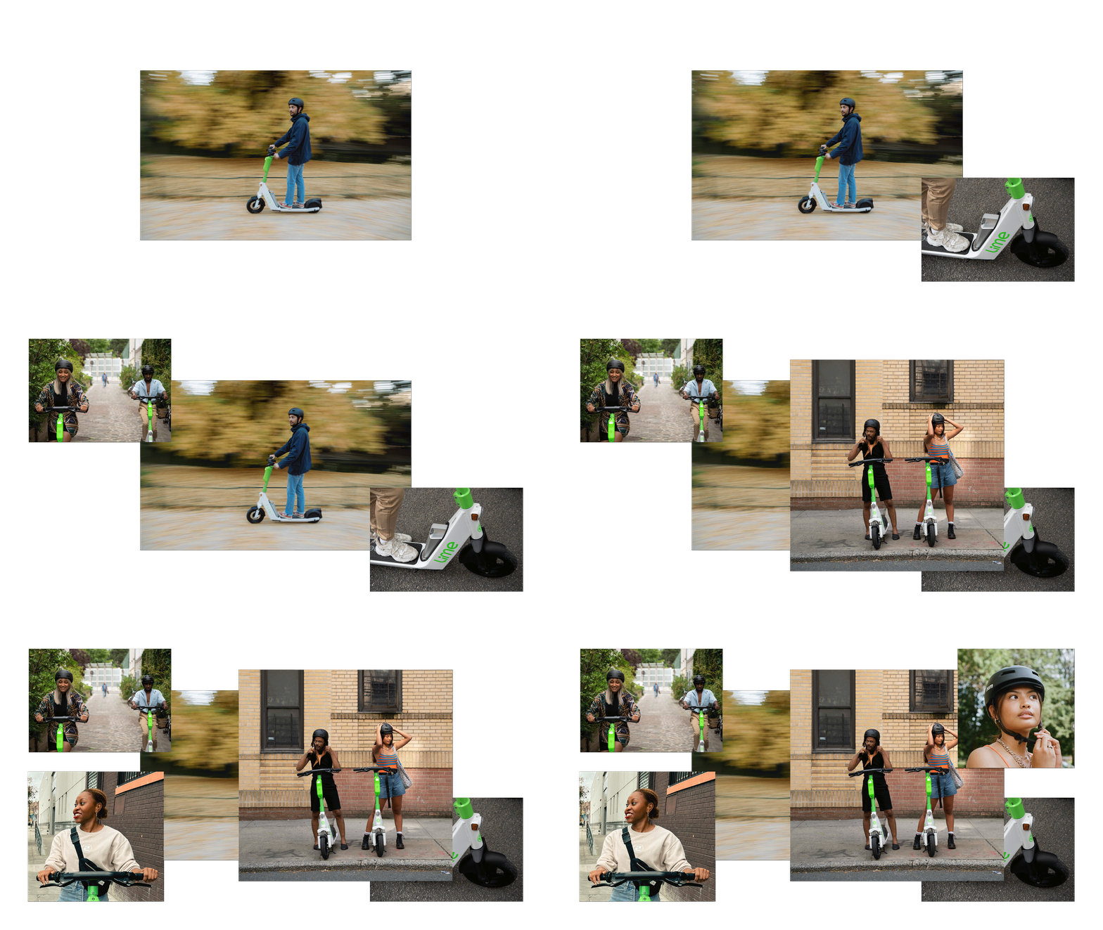
C. Moody photography with authentic moments
To reinforce Lime as a people-first brand, we paired moody, cinematic color grading with authentic, candid photography. Rather than relying on polished advertising imagery, we chose unstaged moments that felt genuine and relatable. The richer tonal treatment reduced visual noise while adding warmth and credibility, helping the website feel more editorial and grounded in real communities.
D. Balancing presence and restraint
Because Lime's neon green is such a defining part of the brand, limiting it only to buttons, eyebrow labels, and other interactive elements made the experience feel visually disconnected from Lime's identity. At the same time, using the color too liberally quickly became overwhelming due to its vibrancy.
Rather than reducing Lime's signature green, we gave it room to breathe: using it strategically in moments that naturally draw attention (such as buttons, eyebrow labels, announcement banners, etc) and larger fields of whitespace to create a brand experience that felt both vibrant and refined.
-
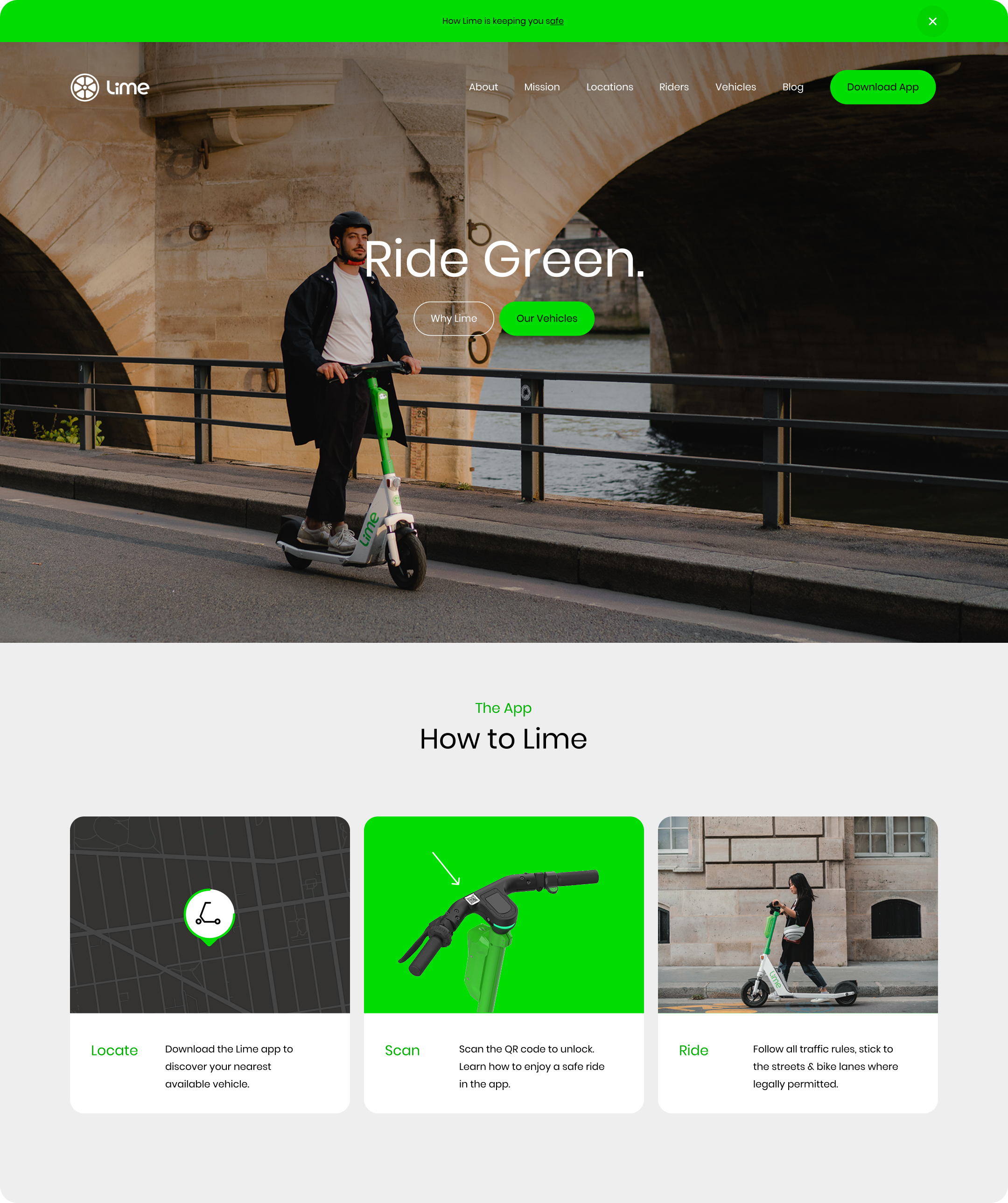
Neon green used for high-impact moments such as calls to action and announcement banners
-
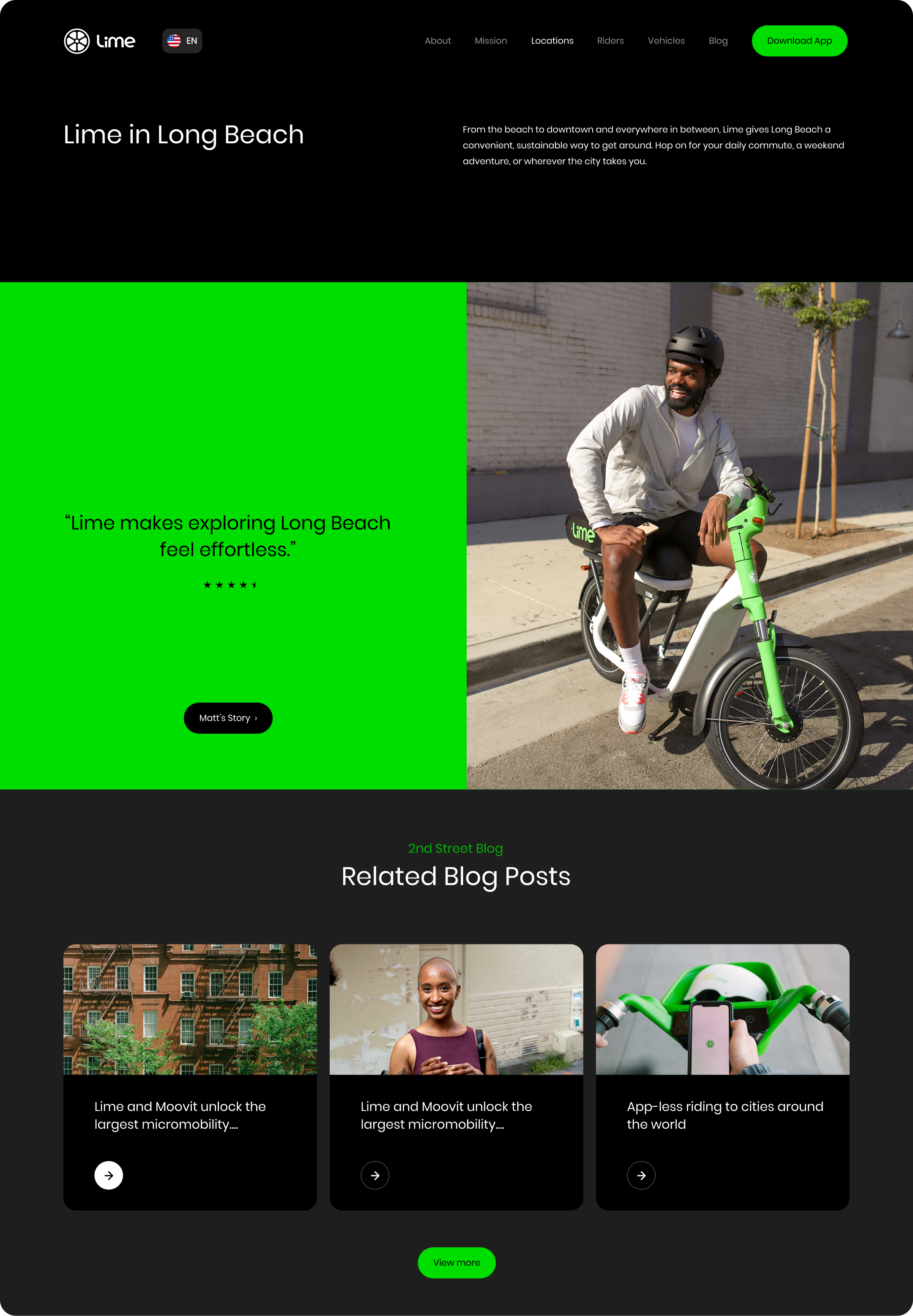
Large green whitespace introduced breathing room and gave Lime’s branding a stronger presence
-
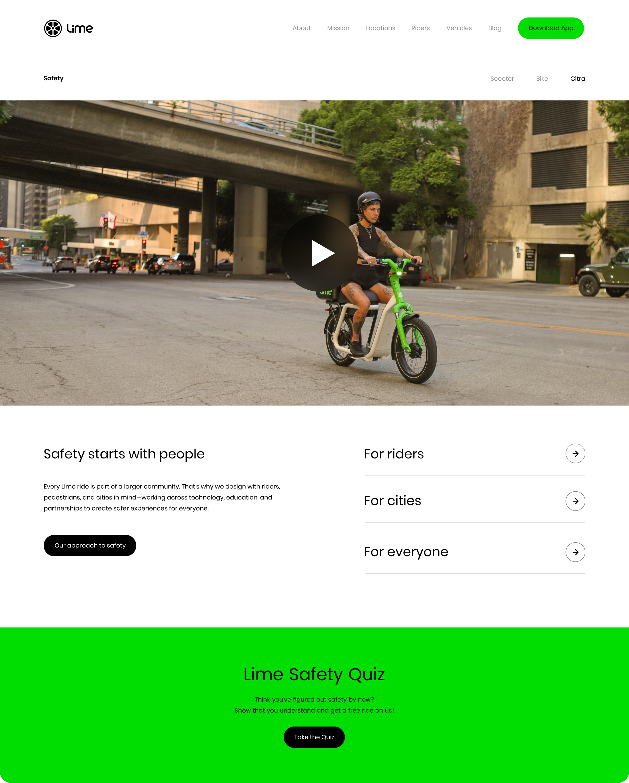
Green backgrounds were used to draw attention key content sections
-
Neon green used for high-impact moments such as calls to action and announcement banners
-
Large green whitespace introduced breathing room and gave Lime’s branding a stronger presence
-
Green backgrounds were used to draw attention key content sections
Design challenge 2:
Reducing clutter without removing content
Challenge
Lime serves a diverse audience, from riders and city officials to investors and members of the press. Each group required detailed information, but displaying all of it at once led to lengthy pages and visual clutter. The challenge was to make this content feel approachable and easy to navigate without sacrificing the depth of information each audience needed.
Design decisions
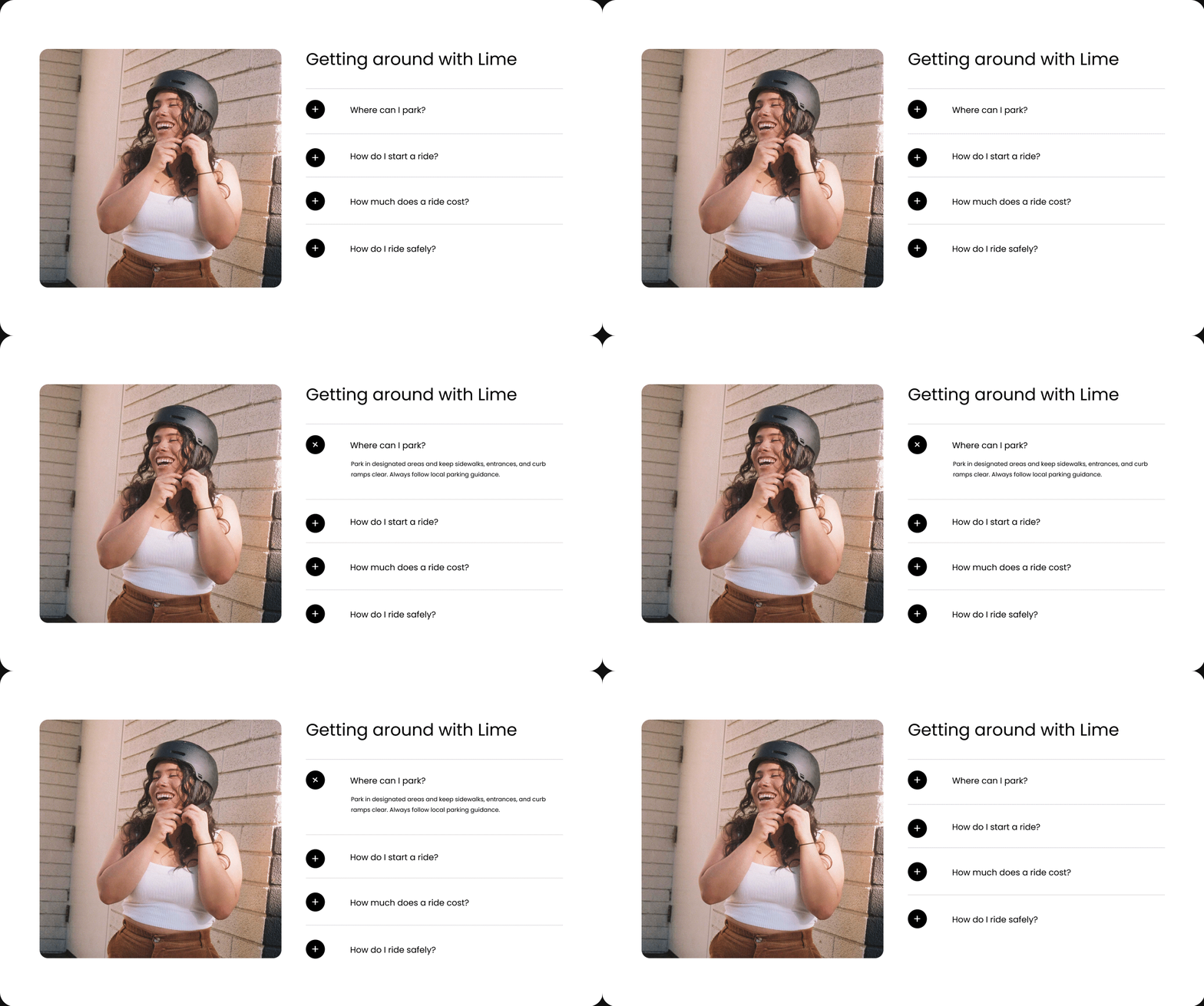
Rather than removing content, we organized it so visitors could quickly scan the page first, then expand sections to reveal additional details only when they wanted them.
A. Accordion components
To reduce visual clutter without sacrificing important information, we incorporated accordion components throughout the website. This allowed visitors to quickly scan content while expanding sections that were relevant to their needs.
Design challenge 3:
Designing across breakpoints
Challenge
As the website expanded, I designed multiple webpages and shared page sections that worked together as a cohesive system. Maintaining consistency across a large marketing site meant balancing flexibility for different types of content while preserving Lime's editorial visual language across every screen size.
My contributions
-
Consistency in designs
Designed multiple webpages while maintaining a unified visual language throughout different screen sizes & devices.
-
Flexible page sections
Refined shared layouts that could support a variety of content.
-
Visual hierarchy
Ensured that typography, spacing, and composition kept the content easy to scan.
-
Responsive design adaptation
Worked closely with engineers to preserve hierarchy and readability across desktop, tablet, and mobile.
-
Editorial quality
Ensured that the brand's premium, editorial feel remained consistent throughout the experience.
-
Consistency in designs
Designed multiple webpages while maintaining a unified visual language throughout different screen sizes & devices.
-
Flexible page sections
Refined shared layouts that could support a variety of content.
-
Visual hierarchy
Ensured that typography, spacing, and composition kept the content easy to scan.
-
Responsive design adaptation
Worked closely with engineers to preserve hierarchy and readability across desktop, tablet, and mobile.
-
Editorial quality
Ensured that the brand's premium, editorial feel remained consistent throughout the experience.
Design challenge 4:
Carrying the project through implementation
Challenge
After our Creative Director departed midway through the project, I became the primary design partner working directly with engineering through implementation. I helped carry the design from Figma to launch while balancing the original visual direction with real-world technical and accessibility constraints.
My contributions
-
Design + engineering collaboration
I worked directly with engineers throughout implementation, reviewing builds and refining spacing, hierarchy, and responsive layouts as technical considerations emerged.
-
Designing within CMS constraints
Adapted our designs to modular CMS components with restrictions around text alignment, spacing, responsive safe areas, and other layout behaviors.
-
Building for future content
Because these modules supported Lime’s frequently updated blog, I established design rules that allowed the system to accommodate new content while maintaining the established visual language.
-
Finding design solutions within constraints
When existing modules couldn't support the intended design, I worked with engineers to rethink and redesign the modules while staying as close as possible to the established visual system.
-
Balancing design + accessibility
Considered accessibility alongside visual fidelity and technical feasibility, ensuring the components remained usable across different audiences and devices.
-
Design + engineering collaboration
I worked directly with engineers throughout implementation, reviewing builds and refining spacing, hierarchy, and responsive layouts as technical considerations emerged.
-
Designing within CMS constraints
Adapted our designs to modular CMS components with restrictions around text alignment, spacing, responsive safe areas, and other layout behaviors.
-
Building for future content
Because these modules supported Lime’s frequently updated blog, I established design rules that allowed the system to accommodate new content while maintaining the established visual language.
-
Finding design solutions within constraints
When existing modules couldn't support the intended design, I worked with engineers to rethink and redesign the modules while staying as close as possible to the established visual system.
-
Balancing design + accessibility
Considered accessibility alongside visual fidelity and technical feasibility, ensuring the components remained usable across different audiences and devices.
Bringing a cohesive design language to life
An intentional exception to the system
While Poppins was Lime's official typeface used throughout the interface, Rider Stories became an intentional exception. Distinct typefaces and covers gave each rider story its own identity while pushing the visual language further into an editorial, publication-inspired direction.
The redesigned Lime website launched as a cohesive, responsive expression of the brand across a wide range of audiences and content needs. I helped carry the experience from initial design through implementation, maintaining the editorial visual language across pages, devices, and evolving content while working closely with engineering to solve responsive, CMS, and accessibility constraints. The result was a scalable digital experience that balanced Lime’s bold brand identity with a more refined, trustworthy, and people-first visual expression.
Outcome

-
⋆ American Graphic Design Award ⋆
— Annual Graphic Design USA Awards
Category: Website Design
2022
-
⋆ American Graphic Design Award ⋆
— Annual Graphic Design USA Awards
Category: Website Design
2022
This project taught me that creating a strong digital brand experience is as much about restraint and intention as it is about expression. We didn't need to tone down Lime's bold identity to make the website feel trustworthy and people-first; instead, we found ways to give those qualities room to emerge through photography, color, typography, content structure, and thoughtful composition.
Reflection