

Heroines Inc.
HERoines Inc. is a nonprofit in NYC that aims to empower women to create the lives they want to live through events, girl talk, books, videos and more.
Role
Designer
Responsibilities
Product design, website design, branding
1 month
Duration
✽
Background
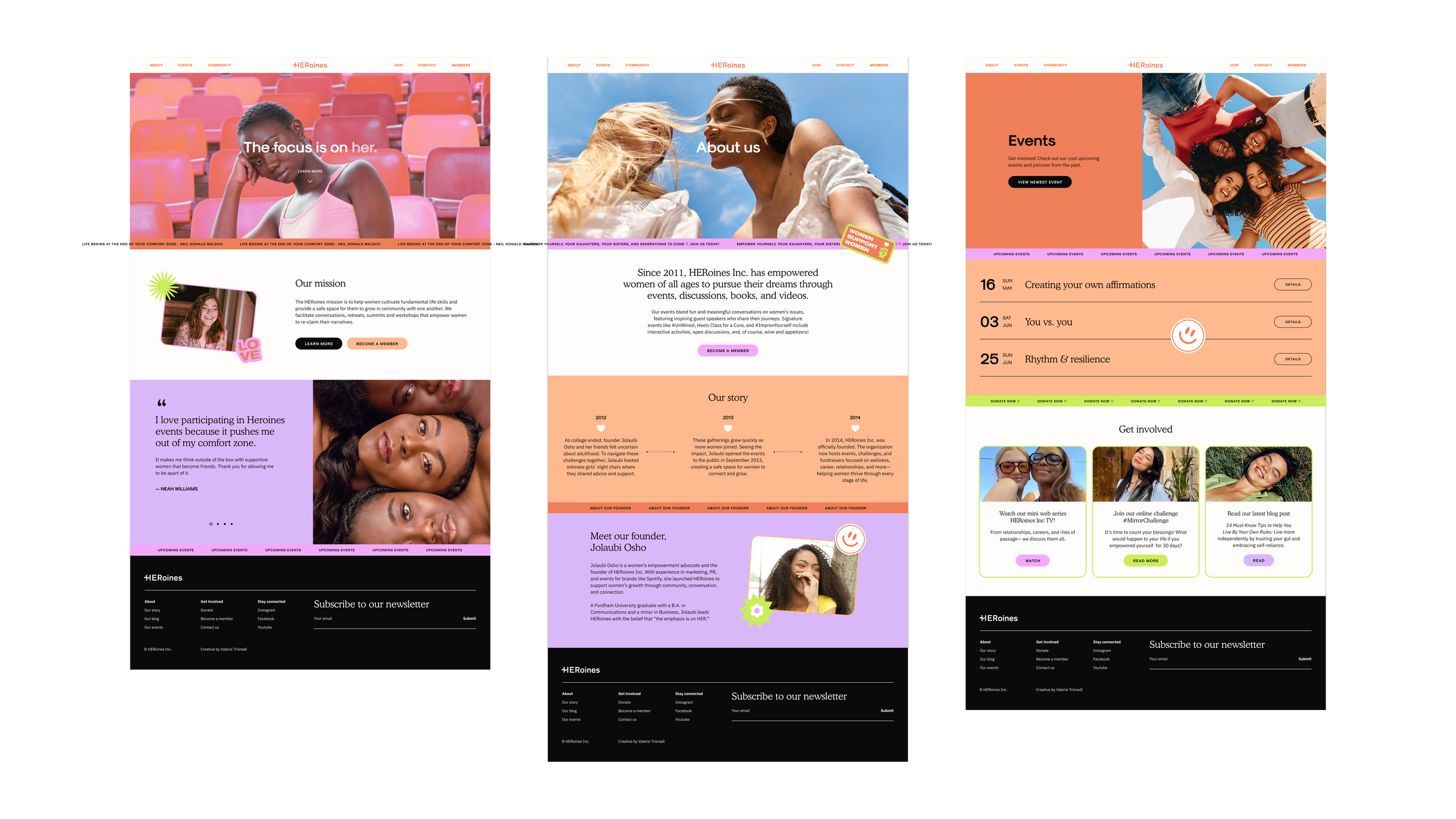
Heroines Inc. was a non-profit that was struggling to gain membership and engagement. During my time at Wix, I worked with Heroines Inc.'s founder to redesign its website and branding based on market research about the NGO's needs.
How might we redesign Heroines Inc.’s digital experience to improve engagement, communicate its mission more effectively, and drive member registration?
✽
Process
Through intensive research about their goals and the needs of their intended demographic (women in their 20s-30s), I proceeded to redesign their website, restructure their site map, create new wireframes, and determine the overall creative direction for their brand.
A. Branding direction
The visual identity centered around themes of sisterhood, empowerment, and authenticity, drawing inspiration from contemporary women-focused brands and editorial campaigns that celebrated candidness, individuality, and community.
B. Brand attributes
-

Sisterhood
-

Empowerment
-

Community
-

Growth
-

Women navigating life together
C. Typography
The typography system combined expressive serif headlines with highly legible sans-serif body text to balance emotional warmth with clarity and accessibility.
-
Used for headlines and large quotes.
-

Used for body copy and interface readability.
-

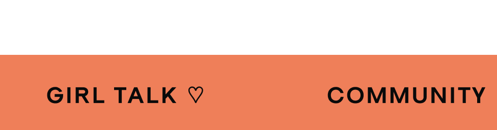
Used for eyebrow labels, ticker tapes, buttons, and large headers.
-
![]()
H1
-
![]()
H2
-
![]()
Body
-
![]()
Button
-
![]()
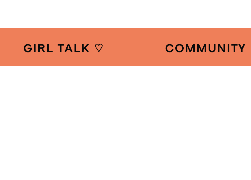
Ticker tape
-
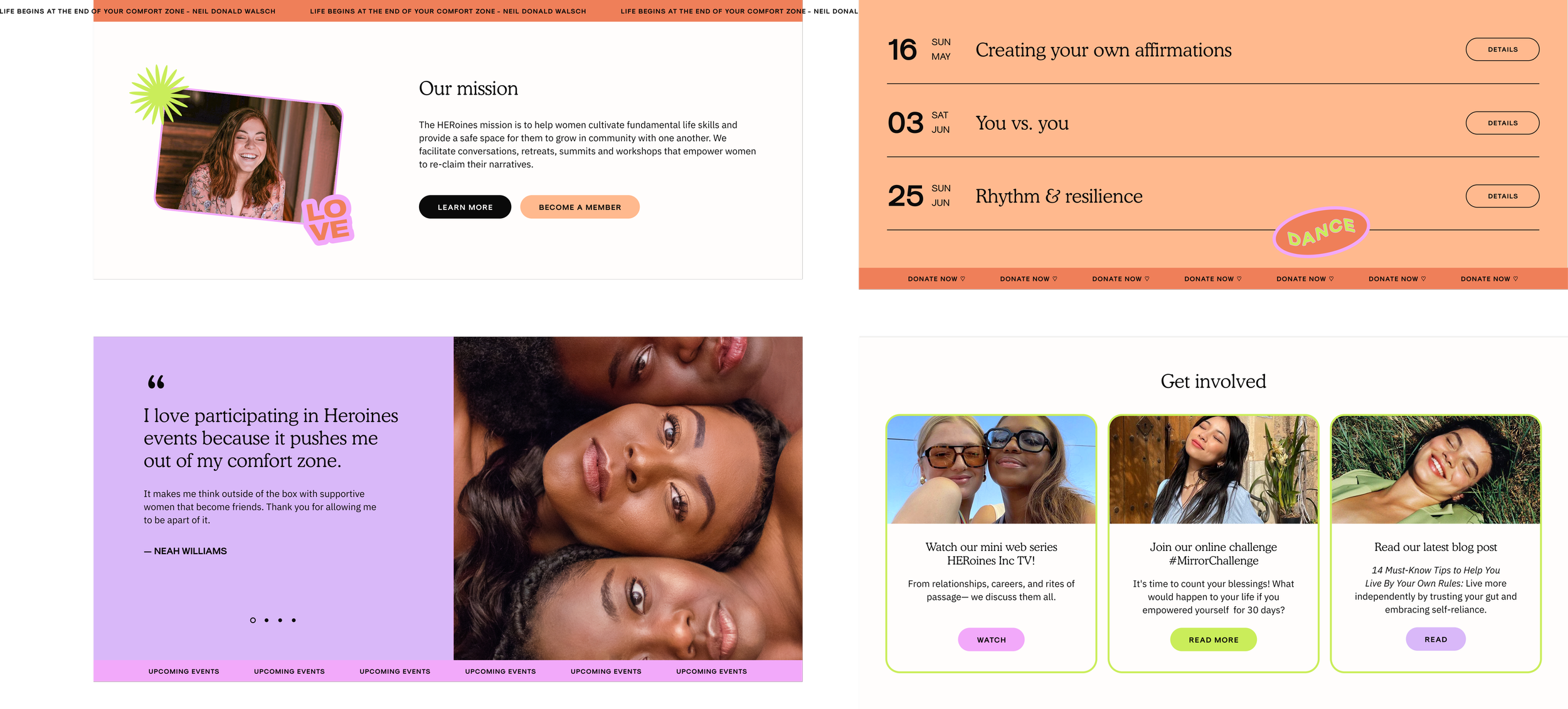
Typography in context
-
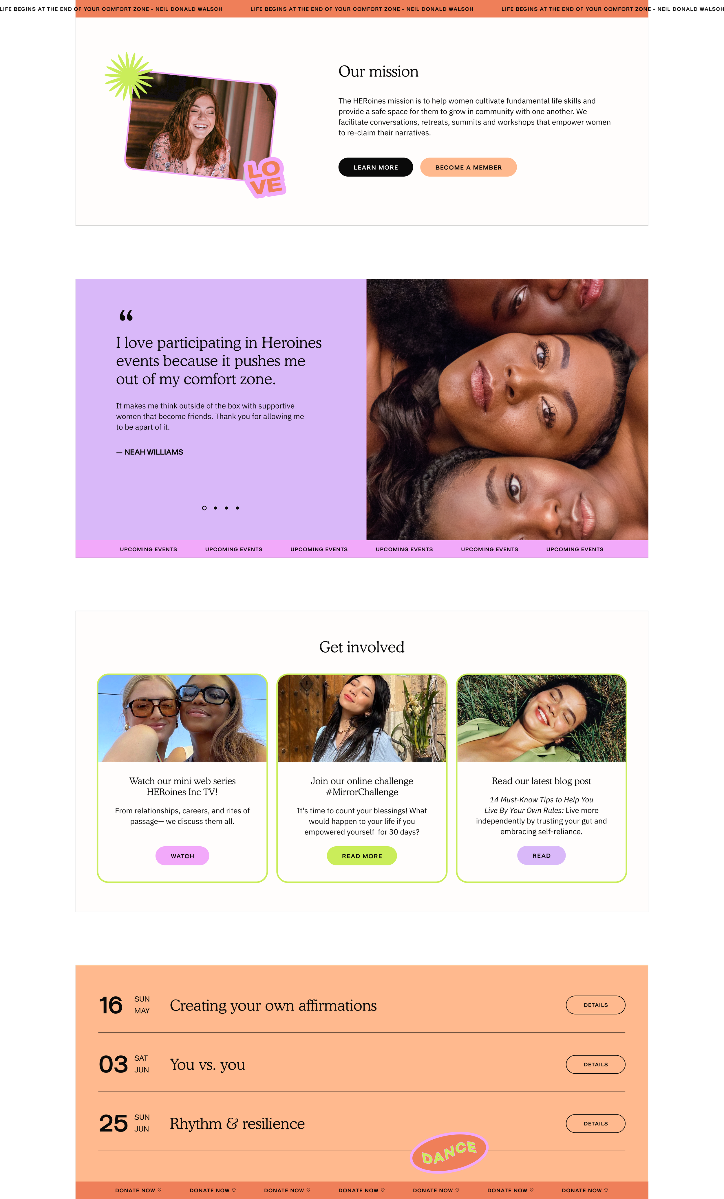
Typography in context
-
H1
-
H2

-
Body
-
Button

-
Ticker tape
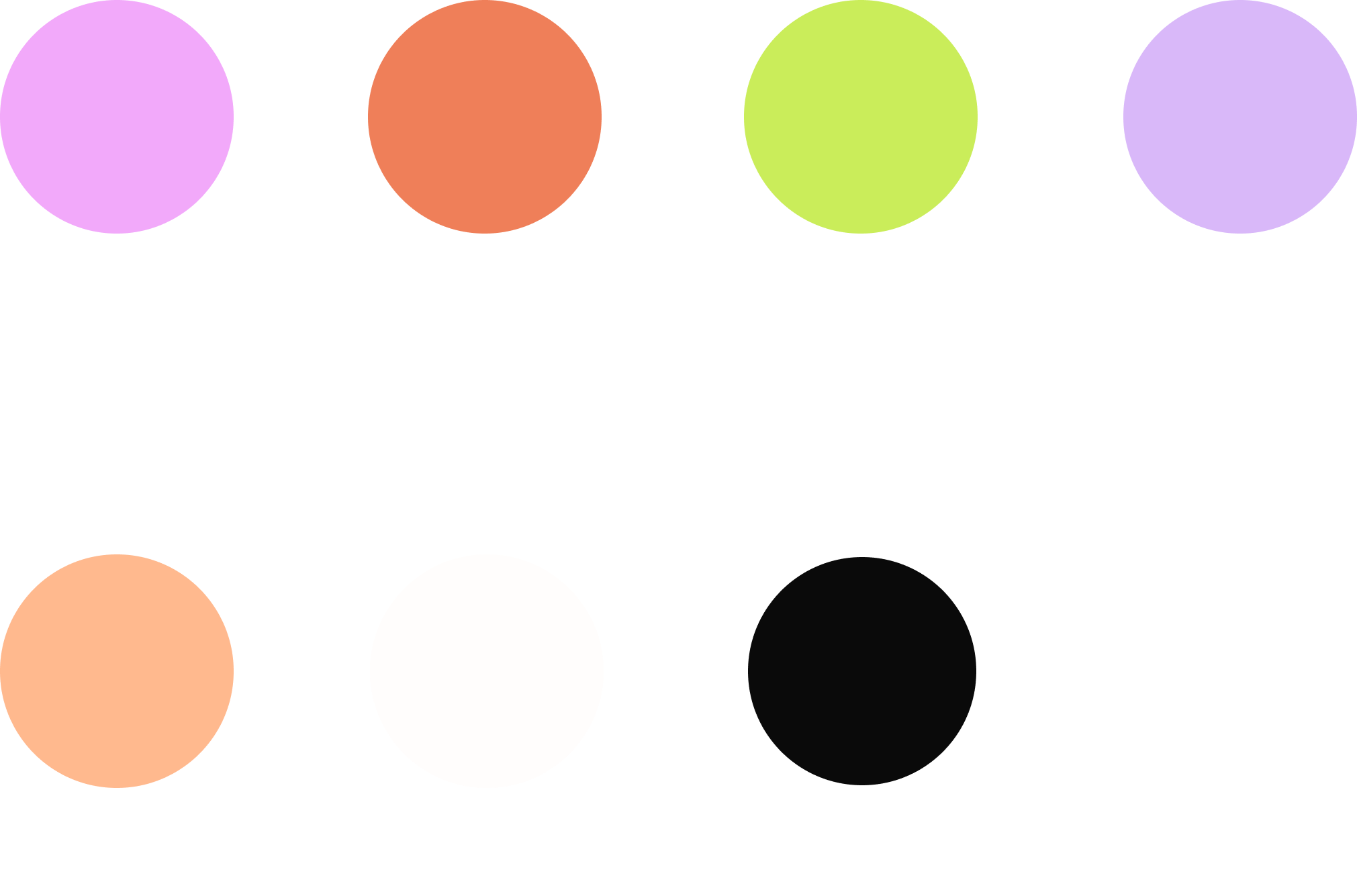
D. Color palette
A vibrant palette of pinks, corals, purples, and accent greens was used to create an energetic and optimistic visual identity that felt expressive, youthful, and community-oriented. Neon green accents were introduced sparingly to create contrast, draw attention to key actions, and add a contemporary edge to the softer palette.
-

#F2A9FA
-

#EF7F59
-

#CAED5A
-

#D9B8F9
-

#FFB98E
-

#FFFDFC
-

#0A0A0A
E. Illustration System
Custom sticker-style illustrations and typography were created to reinforce themes of empowerment, self-expression, and solidarity throughout the digital experience.

F. Photography direction
The photography direction emphasized candid, vibrant, and emotionally authentic imagery inspired by contemporary women-centered campaigns from brands like Glossier and Billie. Images focused on natural expression, diversity, and genuine interaction to reinforce the organization’s mission of community and belonging.

G. UI branding language
Repeating ticker tape dividers and sticker-style graphic elements were incorporated throughout the site to create movement, reinforce messaging, and establish a playful but cohesive visual language.
✽
Results
Within 3 months of launch, the redesigned website drove a 260% increase in member registrations and was featured in multiple publications.
Featured in
-
3 nonprofit rebrandings that show the power of design in amplifying a mission.
— Fast Company, 2019
-
21 Best Nonprofit Websites That Truly Make a Difference
— Wix, 2021
-
The 30 Best Websites of 2022: Best Non-Profit Website
— Wix, 2022
Featured in
-
3 nonprofit rebrandings that show the power of design in amplifying a mission
— Fast Company, 2019
-
21 Best Nonprofit Websites That Truly Make a Difference
— Wix, 2021
-
The 30 Best Websites of 2022: Best Non-Profit Website
— Wix, 2022